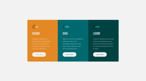
3 column preview card with responsive layout (HTML CSS Flex)

Solution retrospective
Completed challenge. Feedback: Correct use of heights in this. Having trouble centering vertically (can't figure out which units are best and how to center the card in the middle of the page - had to resort to using margins and changing the height values in the media query). As you will see, the little sub text at the bottom disappears when in mobile view but is present in wide view.
Any tips and advice on how to improve on this would be a really big help! Thanks in advance.
Please log in to post a comment
Log in with GitHubCommunity feedback
- @dewslyse
Hello Tom! Good job on this.
On centering the card, you're already on the right track. You need to set the height on your
.containerselector and set the margin toauto. You should do away with the196pxmargins top and bottom.Marked as helpful

Join our Discord community
Join thousands of Frontend Mentor community members taking the challenges, sharing resources, helping each other, and chatting about all things front-end!
Join our Discord