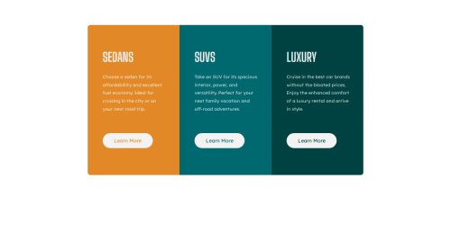
3 column preview cards using CSS Grid

Solution retrospective
I had trouble with the responsive design and centering the div container... Any feedback would be appreciated :)
Please log in to post a comment
Log in with GitHubCommunity feedback
- Account deleted
Hey @raf0411 🙂Just
wonderful solutionand Its really look like apixel perfect solutionthat's why I checked yoursource codeand there I found somecommon problemsand you really easily canfix them<h1> tag:
Every page only need one <h1> tag because <h1> tag is for page title and every page only had one title.
H1 tags help Google to understand the structure of a page. So if you're using H1s as Google recommends for your page title or content heading, your H1 is effectively telling Google “here's what my page is about.
and in your solution you used
<h1> tagfor three time and there instead of<h1> tagyou can use a<h2> tag.and you can use
<h1> tagwith asr-onlyclass<h1 class="sr-only">3 column preview card component</h1>CSS:.sr-only:not(:focus):not(:active) { clip: rect(0 0 0 0); clip-path: inset(50%); height: 1px; overflow: hidden; position: absolute; white-space: nowrap; width: 1px; }your question (div is not centered):
for this particular solution you can
hard code the valueof container and for more info you also can take a look ofmy solutionHope that was helpful for you...Marked as helpful
Join our Discord community
Join thousands of Frontend Mentor community members taking the challenges, sharing resources, helping each other, and chatting about all things front-end!
Join our Discord