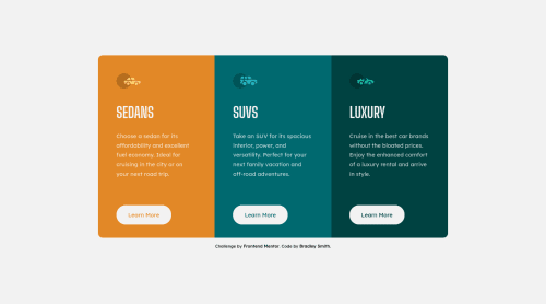
Submitted over 3 years agoA solution to the 3-column preview card component challenge
3 Column Preview Cards written using Vue.js, Sass
sass/scss, vue

@bradleyhop
Solution retrospective
This one was relatively simple. When sizing elements (padding, margins, etc), I tend to use 'rem' units everywhere to keep scaling consistent (especially when using the zoom only text option in browsers). Is it better to use 'em' or some other measure? I guess I'm asking where's a good resource for learning to build elements of your site that scale well?
Code
Loading...
Please log in to post a comment
Log in with GitHubCommunity feedback
No feedback yet. Be the first to give feedback on Bradley Smith's solution.
Join our Discord community
Join thousands of Frontend Mentor community members taking the challenges, sharing resources, helping each other, and chatting about all things front-end!
Join our Discord