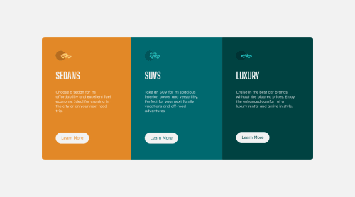
Not Found
Not Found
Not Found
Not Found
Not Found
Not Found
Not Found
Not Found
Not Found
Not Found
Not Found
Not Found
Not Found
Not Found
Not Found
Not Found
Not Found
Not Found
Not Found
Not Found

Submitted

3 Column preview component using html, css and flexbox

@swethalakshmi22

Desktop design screenshot for the 3-column preview card component coding challenge

This is a solution for...

  • HTML
  • CSS
1newbie
View challenge

Design comparison


SolutionDesign

Solution retrospective


I would like to hear any feedback or improvements on my code.

Community feedback

@atinybeardedman

Posted

This looks good. Here are a few suggestions:

  1. I think you could swap out a div for a span element for your logo. If you inspect it, you'll notice the child svg is actually expanding outside the span since the span element is inline and doesn't calculate it's width and height based on it's children the same way as a block level element.

  2. Your mobile solution doesn't have the white space around the cards as shown in the preview. A better solution than using flex-wrap is to explicitly change the flex-direction to column when you hit the mobile breakpoint. Then you can set a max-width to 90% or something similar on the cards to get that padding.

  3. I don't think you should be adjusting the height manually for the mobile breakpoint, rather just adjust the padding. Setting explicit heights for something like this is bad practice in case the content changes and then you run into overflow problems.

0

@Andrii-Rohov

Posted

Hi, nice solution. You can improve it by adding cursor: pointer; to buttons.

0

Please log in to post a comment

Log in with GitHub
Discord logo

Join our Discord community

Join thousands of Frontend Mentor community members taking the challenges, sharing resources, helping each other, and chatting about all things front-end!

Join our Discord