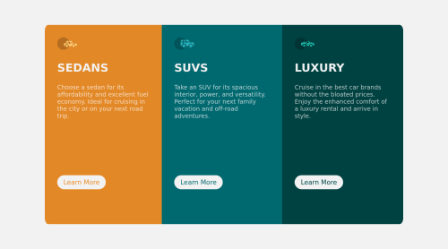
3 Responsive Columns Using Flex and Mobile-first workflow

Solution retrospective
I decided to take advantage of first-child and last-child pseudo-classes to make some changes in the border-radius of my vehicles. I though this way cause I needed to change the border-radius only in the first and last element of the divs using ".vehicle" class. Since the border-radius just change in this both elements.
I thought about using another class for it, but I think this way using pseudo-classes was better. What do u think about it? Should I do it in another way?
Another thing I would love to understand better is the use of more advanced html tags. If u see my code u will see I used sections tag but I don't really know why I should do it and I don't know when I should do it. So, if u have any advice about it, It would be amazing!
I think that's it.
Please log in to post a comment
Log in with GitHubCommunity feedback
No feedback yet. Be the first to give feedback on Nikolas Matias's solution.
Join our Discord community
Join thousands of Frontend Mentor community members taking the challenges, sharing resources, helping each other, and chatting about all things front-end!
Join our Discord