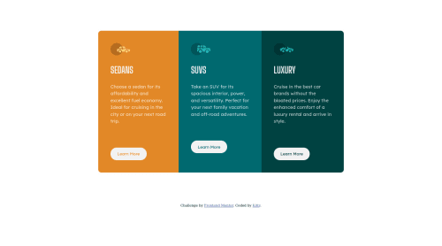
3-Column Card Site with Flexbox

Solution retrospective
If anyone has some tips of centering elements, that'd be great!
Please log in to post a comment
Log in with GitHubCommunity feedback
- @fasih-mehmood
Flexbox is definitely the way to go when it comes to centering elements. Also avoid using ID's as much as you can and make use of classes instead. Avoid using absolute sizes as well, instead of pixels, try using % or rem or em.
Other than that, the solution looks great! Keep up the good work.
Marked as helpful - @darryncodes
Hi Faylette,
Great solution, well done.
Try this on your
.containerclass:display: flex; flex-direction: column; flex: 1;And on mobile add
align-self: start;to the<button>styles so the button doesn't span all the way across.Also you'll need to play around with
margin-bottom: 75px;on your<p>too.Good luck!


Join our Discord community
Join thousands of Frontend Mentor community members taking the challenges, sharing resources, helping each other, and chatting about all things front-end!
Join our Discord