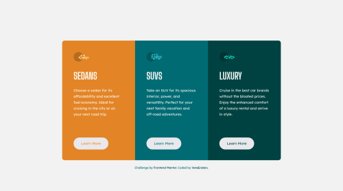
Responsive card component

Solution retrospective
Happy to hear any feedback!
Please log in to post a comment
Log in with GitHubCommunity feedback
- @MelvinAguilar
Hello there 👋. Good job on completing the challenge !
I have some feedback for you if you want to improve your code.
HTML 📄:
- Use the
<main>tag to wrap all the main content of the page instead of the<div>tag. With this semantic element you can improve the accessibility of your page.
- You should use the
<a>tag instead of the<button>tag because theLearn Morebutton is a link to another page. Use buttons to perform actions like submitting a form or closing a modal and use links to navigate to another page. You can read more about this here 📘.
-
Not all images should have alt text. Car icons are for decoration purposes only, so they can be hidden from screen-readers by leaving its alt attribute empty.
The main reason for hiding an image from screen readers is that images can be used for decorative elements and may not provide any meaningful information to users of assistive technology. Hiding them from screen readers can prevent confusion and reduce the amount of unnecessary information that is read to users.
- You must use a level-one heading (h1) even though this is not a full-page challenge. You can create an '<h1>' element within your 'main' element that will be hidden visually but visible and readable by screen readers. The class "sr-only" hides content visually and here are the styles to copy. e.g.:
<h1 class="sr-only">3-column preview card component</h1>
I hope you find it useful! 😄 Above all, the solution you submitted is great!
Happy coding!
- Use the

Join our Discord community
Join thousands of Frontend Mentor community members taking the challenges, sharing resources, helping each other, and chatting about all things front-end!
Join our Discord