3-column preview card component #5

Solution retrospective
Feedback welcome .
Please log in to post a comment
Log in with GitHubCommunity feedback
- @MohamedAridah
Hello @DefinitelyObsessed , Great job for this challenge.
I have some notes for you:
-
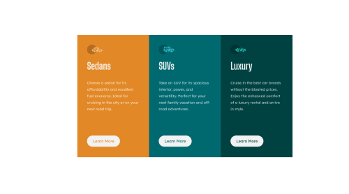
As LiBee mentioned above the card not centered. This problem cause horizontal overflow for small screens.
-
Add
transitionproperty for<button>elements on hover for smoother effect on hover on it -
you can leave card's image
altattribute Empty. Because these icons not necessary it's just for decoration. And this one of the cases leaving alt attribute empty is a good practice. -
instead of redeclaring
font-familyfor each element individually. You can set it to the body globally.
	body {
		font-family:  "Big Shoulders Display", sans-serif;
	}
I hope this wasn't too long for you, hoping also it was useful😍.
Goodbye and have a nice day.
Keep coding🚀
Marked as helpful -
- @dostonnabotov
Hi, there! That looks great. Except, you need to add
border-radiuson large screen sizes. Also, it is good to setflex-direction: column;on your cards on smaller screen sizes if you have usedflexon them. Good luck!Marked as helpful - @Li-Bee
Good job on the challenge - well done! 👏 A have a few comments for your consideration - i have listed below for ease :
- The card is not quite in the center consider using flexbox to center the card component:
body { display: flex; justify-content: center; align-items: center; flex-direction: column; }-
The titles Sedans, Suvs and Luxury need to capitalised in the design so:
text-transform: uppercase; -
Compared to the design you need to smooth corners of the card component do add a border radius
-
Compared to the design the background is not white (#fff) need to add shade to the background.
-
To fix your accessibility issues add
<main></main>around your code.
Marked as helpful


Join our Discord community
Join thousands of Frontend Mentor community members taking the challenges, sharing resources, helping each other, and chatting about all things front-end!
Join our Discord