Submitted about 4 years agoA solution to the 3-column preview card component challenge
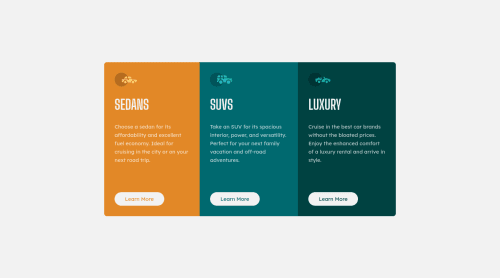
3-column preview card component

@tttinh
Solution retrospective
Hello everyone,
Hope you have a good day. This is my second exercise. I would like to receive any feedback or comment to help me improve my skills.
Thanks so much.
Code
Please log in to post a comment
Log in with GitHubCommunity feedback
- @aUnicornDev
Few things to point out,
1.Don't go to mobile view so early, you can shrink to upto 1000px and then go mobile
2.You probably used
outlineproperty on hover because you didn't want the content to move the layout which would have happened in case you used border property.But the outline does not create a rounded hover but a rectangular one.
A fix to that is.. use
box-shadow: inset 0px 0px 0px 2px #fff;instead of a border or outline..Marked as helpful

Join our Discord community
Join thousands of Frontend Mentor community members taking the challenges, sharing resources, helping each other, and chatting about all things front-end!
Join our Discord