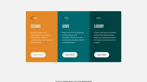
3-column preview card component

Solution retrospective
Hello everyone! 👋
Thanks for checking my solution code to the 3-column preview card component challenge
At my learning process I learned how to use in nth-child in stylesheet in order to use different styles instead creating more classes.
.col:nth-child(1) button {
  color: var(--bright-orange);
}

.col:nth-child(2) button {
  color: var(--dark-cyan);
}

.col:nth-child(3) button {
  color: var(--very-dark-cyan);
}
also I learned how to use in outline method for button activity states, because somehow, using in border method, expanded other elements size.
.col .button:hover {
  background: none;
  outline: 2px solid var(--background-headings-buttons);
  color: var(--background-headings-buttons);
}
I'm happy to see that after 6 challenges I did, the process of coding became faster for me.
Built with
- Semantic HTML5 markup
- CSS custom properties
- Flexbox
- CSS Grid
- Desktop-first workflow
Please log in to post a comment
Log in with GitHubCommunity feedback
- Account deleted
Hey @kirawesh, some suggestions to improve you code:
-
Along with the blank alt tag, you also want to include the aria-hidden=“true” to your car images/icons to fully remove it from assistive technology.
-
The headings are being use incorrectly. For this challenge, each heading is equally as important. So best option, is to use <h2> Heading, because it will give each card the same level of importance and it's reusable.
-
Your "buttons" were created with the incorrect element. When the user clicks on the button they should directed to a different part of you site. The Anchor Tag will achieve this.
-
Implement a Mobile First approach 📱 > 🖥
With mobile devices being the predominant way that people view websites/content. It is more crucial than ever to ensure that your website/content looks presentable on all mobile devices. To achieve this, you start building your website/content for smaller screen first and then adjust your content for larger screens.
Happy Coding! 👻🎃
Marked as helpful -
- @correlucas
👾Hello @kirawesh, Congratulations on completing this challenge!
Great code and great solution! I’ve few suggestions for you that you can consider adding to your code:
1.You made your html structure entirely with
div blocksbut these div doesn't any semantic meaning, for this reason is better you use a better html markup improving your code, for example for each vehicle card you use<article>instead of the<div>.2.Your solution seems fine, you did a really good job wrapping the content for these 3 cards. Something you can improve here is to use a
single classto manage the content that is mostly the same for the 3 cards (paddings, colors, margins and etc) and another class to manage the characteristics that are different (colors and icon), this way you'll have more control over then and if you need to change something you modify only one class.3.Create the mobile version with a media query:
@media (max-width: 500px) {
.columns {
    display: grid;
    grid-template-columns: 1fr;
}
}
✌️ I hope this helps you and happy coding!
Marked as helpful - P@miranlegin
Hi Kira,
congratulations on completing this challenge!
Getting faster and more confident is a nice feeling isn't it?
Now let's get back to feedback. I won't go into semantics because previous poster reviewed that part. The part i'm most interested is the CSS and i think there are some improvements to be made there.
- line 44 of style.css has some invalid properties which can be inspected in Dev Tools, this is on
.columnsdeclaration. - you have used
border-radiuson a single .col elements and make your job more difficult and styles harder to mantain, you can instead put all rounded corners on parent div.columnsbecause no matter what the direction on the cards is they will always have all four corners rounded, also you need to applyoverflow:hiddenon a parent to stop children's background to spread outside of the corners - most of the spacing here on the platform is based on a 16px value which is 1rem by browsers default, you can apply that logic when dealing with margin/padding spacing stuff, if it's 24 it is 1.5rem/em, 32 is 2rem/em etc. I found the best way to use rem's for applying layout stuff and spacing around text is easier with em because it is calculated based on font size of an element. For example: h1 has a font-size of 24px, and margin bottom of 12px, if your h1 grows on the larger viewport you need to manually enlarge the bottom margin. if you use 1.5rem as a base font size, and put 0.5em as a margin top, when you enlarge you font-size margin will always be 50% of that font size because em is relative to the element's font-size.
- i've noticed that you declared your custom properties with this naming convention:
  --lexend-deca: 'Lexend Deca', 'sans-serif';
  --big-shoulders-display: 'Big Shoulders Display', 'sans-serif';
this is somehow limited because if font is about to be changed you would also need to change the name to because it doesn't make any sense to have custom property
--lexend-decawhich points toopen sansfont for instance. that way you are playing cat and mouse because now you have to replace all the instances of this font throughout the whole stylesheet and you made yourself a recipe for disaster. Better way would be to name it like a--font-basewith--font-headingfor example. 5. also i would suggest to take a look at some of the modern CSS resets to just have a clean start each time, you can adjust it to your needs later if you need to or add couple of things if you find necessaryBoth of them did a great job with explaining all the individual rules they created so check them out!
Keep coding and see you on another challenge!
Cheers, Miran
Marked as helpful - line 44 of style.css has some invalid properties which can be inspected in Dev Tools, this is on


Join our Discord community
Join thousands of Frontend Mentor community members taking the challenges, sharing resources, helping each other, and chatting about all things front-end!
Join our Discord