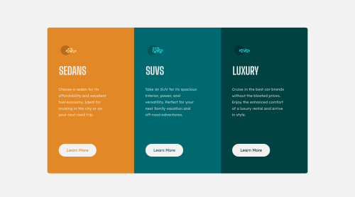
3-column preview card component

Please log in to post a comment
Log in with GitHubCommunity feedback
- @correlucas
👾Hello Rosalia, congratulations for your solution!
I saw your live site and is really good done, all the design elements are perfect.
My advice for you is to set the media query a little later and let the vertical container contract a little bit more or let the
container grow almost 100% of the screenwhen themedia querychanges`, you can note that there's a big big space between the card and the screen borders when the component change the flow vertically.There's also no need to set a fixed
heightfor each column like.sedan-column, .suv-column, .luxury-columnthe column will grow only with the elements and its paddings/margins, if you set a fixed height this can make the content get cropped when the container start to scales and overlap the fixheight.Marked as helpful - @afaiz-space
Hey @RosaliaLey,
- Remove
margin: 0 0 0 2em;from the .sedan-column, .suv-column, .luxury-column class.
Marked as helpful - Remove
- @AdamMzkr
Great job but, you can add a little bit bottom padding in each column in mobile view that's in my opinion will looks better 😉


Join our Discord community
Join thousands of Frontend Mentor community members taking the challenges, sharing resources, helping each other, and chatting about all things front-end!
Join our Discord