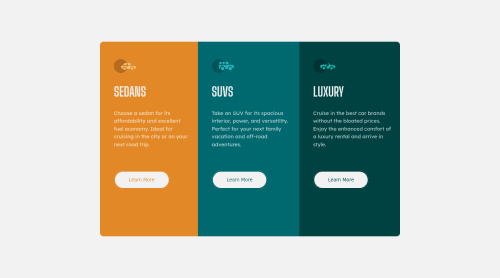
Submitted almost 4 years agoA solution to the 3-column preview card component challenge
3-column preview card component challenge hub
accessibility, backbone, bem, bulma, bootstrap

@Ganesh-Rathor
Solution retrospective
this is my best clear work with flex and positioning But one thing that sour in my eyes is the default margin between two element I do margin: 0; of body container and container item but this margin wasn't remove
plese Give me feedback on 1.how I Null the default margin 2. how I do the page responsive for mobile I do it @media (max-width: 400px) .container{ flex-direction: coloum;} but it doesn't working
Code
Loading...
Please log in to post a comment
Log in with GitHubCommunity feedback
No feedback yet. Be the first to give feedback on Ganesh's solution.
Join our Discord community
Join thousands of Frontend Mentor community members taking the challenges, sharing resources, helping each other, and chatting about all things front-end!
Join our Discord