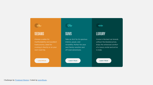
3-column preview card component challenge hub

Solution retrospective
Hi! I have just started in the world of web development and this is my first project. I'd like to know your point of view. What should improve?
Please log in to post a comment
Log in with GitHubCommunity feedback
- @grace-snow
Well done on the improvements. Looks much better 👏
Here are some more suggestions, some optional, some essential
- don't capitalise text in html, use css text transform
- Desc needs a little margin bottom so the button and text aren't touching (viewing on mobile)
- You don't need to change body height and width in the media query
- Did you mean column wrap in the media query? Or did you just mean to change flex direction to column
- Still include a fallback font for big shoulders display family
- Line height never in px. That won't scale. Line height is usually unitless like 1.5 or can be %
- Font size never in px. That won't scale. Use rem
- Did you mean to make the links display flex? That stretches them the full width available. Did you actually mean to use inline-block or inline-flex perhaps?
- No need to but background color on a paragraph, it's transparent by default
- Don't forget to add obvious focus-visible styles to every interactive element. This is essential to make it clear for keyboard users where is focused on a page
In html
- sections add no additional semantics here, divs would be fine
- Header is the wrong element to use. I think you mean to use h2?
- if you consider icons to be decorative, their alt attribute should be empty. If you think they offer meaningful content, the alt description should describe them like any written phrase, not hyphenated text for the computer
Marked as helpful - @osoriodev
Hello 👋
A couple of things that I can recommend you
- Try not to use
<br>tags, since these modify the document flow and that must be done from the CSS. If you want to create a spacing, you can use the margin properties. - Use more semantic HTML, for example Sedans, Suv and Luxury are titles, in this case you can use HTML title tags, the
spanis for text that has no relevance.
Overall, your project is a good start. Keep coding 👨💻
Marked as helpful - Try not to use
- @grace-snow
Hi Thomás
It's important you don't move on and spend some time refactoring this project. It will be essential for learning.
Here are notes I made in browser. I recommend you go through them one by one watching the results. It will look broken at times as you make the changes, but as you do more they will fix again.
body {
  /* position: relative; */
  /* height: 100vh; */
  /* width: 100vw; */
  min-height: 100vh;
  padding: 1rem;
  note: min-height allows content to grow. Padding stops the content hitting screen edges. No need for position relative.;
}

.mainContainer {
  /* position: relative; */
  /* justify-content: center; */
  /* align-items: center; */
  max-width: 58rem; // or similar - use pixels for now if you like
  border-radius: 0.75rem;
  overflow: hidden;
  note: border-radius and overflow hidden on this means you don't have to set it on individual corners;;
  note: this should be a main element (a landmark);

}

.mainContainer div {
  /* width: 290px; */
  /* height: 460px; */
  note: again, use a reusable card class on all 3 cards;
}

* {
  /* font-size: 15px; */
  font-size: 0.9375rem;
  note: NEVER have font size in px;
}

.sedanContainer {
  /* position: relative; */
  /* border-top-left-radius: 5px; */
  /* border-bottom-left-radius: 5px; */
}

div img {
  /* display: flex; */
  /* position: relative; */
  /* background-color: inherit; */
}

span {
  /* font-size: 36px; */
  font-size: 2.5rem;
  note: Must be a heading element;
}

#sedan-button {
  note: Never style on IDs;
}

.button {
  /* position: relative; */
  /* border-radius: 50px; */
  /* padding: 13px 30px; */
  border-radius: 2.5em;
  padding: 1em 2em;
  margin-bottom: 0;
  margin-top: auto;
  note: because this is a flex column, margin top auto will push it to the bottom of the cards.;
  note: These would trigger navigation so must be anchor tag elements, not button elements;
}

@media (max-width: 375px) {
    note: media query needs to start as soon as there isn't room for the larger screen layout. 375px is way too late to change as I shrink the screen down.;
}

.mainContainer > * {
  note: this would be better done with the same class on all three cards instead of a very specific css selector like this;
  display: flex;
  flex-direction: column;
  align-items: flex-start;
}

.mainContainer div > * {
  // set everything inside the cards to have some margin in one direction. Only the btn wont need it
  margin-bottom: 1.5rem;
}

.mainContainer > * {
  note: Delete all the brs;
}


Join our Discord community
Join thousands of Frontend Mentor community members taking the challenges, sharing resources, helping each other, and chatting about all things front-end!
Join our Discord