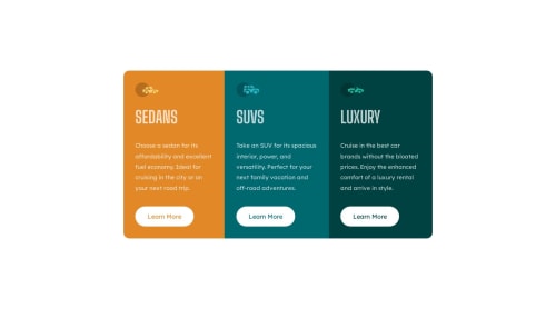
3-column preview card component

Solution retrospective
I had issue with making this responsive. There is a particular viewport that the middle column does not align with the other columns( to have an idea of what I am talking about you can check my screenshots folder).
Any suggestions on how to figure that out will be appreciated.
Please log in to post a comment
Log in with GitHubCommunity feedback
- P@CarlHumm
Basically you're setting
align-items: centeron your.containerelement which is aligning flex-children to the center based on their height. The height of the other two columns are greater because of the paragraph text, so SUV (With less height) is centered in the middle leaving a gap at the top and bottom.You can read more about it from the following:
You also set width to 800px (fixed) and max-width to 90%. This looks like a typo to me as it should be the other way around. You want the width to try and be 90% but no larger than 800px.
If you want to align the buttons you can apply a margin-top: auto to space them apart from the top content, there are other ways to do this as-well.
_nehal has already mentioned the issue with the border.
Other than this, good job and good luck with making changes and your next project. :)
Marked as helpful - @NehalSahu8055
Hello Coder 👋.
Congratulations on successfully completing the challenge! 🎉
Few suggestions regarding design.
- Use
transparent borderfor no shifting of height on hovering buttons.
.btn{ border: 2px solid transparent; }- Use
background:transparent;on hovering don't use background-color specifically for each
.btn:hover{ background:transparent; }- Use
cursor:pointerfor buttons for more user friendly.
I hope you find this helpful.
Happy coding😄
Marked as helpful - Use


Join our Discord community
Join thousands of Frontend Mentor community members taking the challenges, sharing resources, helping each other, and chatting about all things front-end!
Join our Discord