Submitted about 4 years agoA solution to the 3-column preview card component challenge
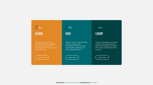
3-column preview card component | HTML - CSS (Flexbox - Grid)

@troguis
Solution retrospective
This is one of the challenges that I have used the BEM methodology and I think it is used correctly, in the same way if you have any suggestion or criticism, I would like you to mention it so that I can continue to improve in the world of web development 💻
Code
Please log in to post a comment
Log in with GitHubCommunity feedback
- @ApplePieGiraffe
Hi there, Soy Troguis! 👋
Good job on this challenge! 👏 Your solution looks great! 👍
A few things I'd like to suggest are,
- Using a single
<h1>tag per page (since that’s commonly considered a good practice, now). Some less important heading tags (such as<h2>or<h3>should work well in this case. - Perhaps adding a little bit of margin around the sides of the card component so that it isn't right up against the edge of the screen when the screen width decreases in the desktop layout.
- You could bump up the semantics of your HTML a bit by using an
<article>tag for the card itself and<section>tags for the sections inside it. 😉
Keep coding (and happy coding, too)! 😁
- Using a single

Join our Discord community
Join thousands of Frontend Mentor community members taking the challenges, sharing resources, helping each other, and chatting about all things front-end!
Join our Discord