3-column preview card component solution

Solution retrospective
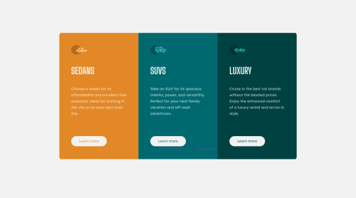
I am a beginner so I would appreciate any tips. My solution is based on grid and I had a problem to center the columns on the page. I will still practice this in other challenges.
Edit: I did it a second time. This time I used Flexbox instead of Grid. Thanks guys for your help :)
Please log in to post a comment
Log in with GitHubCommunity feedback
- @ApplePieGiraffe
Hey there, Maja! 👋
Congratulations on completing your first Frontend Mentor challenge! 🎉 Nice effort on this one! 👏
I suggest layout out all three sections of the card component in a row in the desktop layout and immediately switching to having all three sections in a column instead for the tablet/mobile layout (since having two sections on top of one section of the card looks a little odd). Here's a good solution to this challenge that also uses CSS grid for the layout that might want to check out if you want any ideas. 😉
I would also suggest adding border-radius to a container that wraps all the sections of the card (rather than to the individual cards themselves). That way, you won't have to bother with adjusting the border-radius of the sections when the layout of the card changes. 🙂
Keep coding (and happy coding, too)! 😁
Marked as helpful - @SandeepGumaste
You could have made 3 columns of 1fr each or Flexbox approach would have been better.
Marked as helpful


Join our Discord community
Join thousands of Frontend Mentor community members taking the challenges, sharing resources, helping each other, and chatting about all things front-end!
Join our Discord