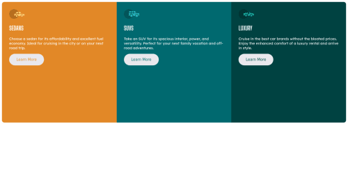
3-column preview card component using flexbox

Solution retrospective
I need help with some errors: -i cannot change the whole radius for the .container. how can i do that? -in mobile phone preview when i click on a button the subcontainer sizes change. -cannot center the .container in desktop preview (when i do that the mobile preview is wrong) -it feels like some code is repetitive how can i shorten it?
Thanks for the help.
Please log in to post a comment
Log in with GitHubCommunity feedback
- @Hassiai
The html must have <h1> to fix the accessibility issues.
Every html must have <h1> to make it accessible. Always begin the heading of the html with <h1> tag wrap the sub-heading of <h1> in <h2> tag, wrap the sub-heading of <h2> in <h3> this continues until <h6>, never skip a level of a heading.
Give the body a background-color.
To center .container on the page using flexbox or grid, add min-height:100vh; display: flex; align-items: center: justify-content: center; or min-height:100vh; display: grid place-items: center to the body.
USING FLEXBOX:
body{
min-height: 100vh;
display: flex;
align-items: center;
justify-content: center;
}
USING GRID: body{ min-height: 100vh; display: grid; place-items: center; }Use relative units like rem or em as unit for the padding, margin, width values and preferably rem for the font-size values, instead of using px which is an absolute unit. For more on CSS units Click here
For a responsive content, there is no need to give .container a height value and give it a fixed max-width value.
max-width:600pxYou forgot to add a media query for the mobile design. For more on media queries, click here
Hope am helpful.
Well done for completing this challenge. HAPPY CODING

Join our Discord community
Join thousands of Frontend Mentor community members taking the challenges, sharing resources, helping each other, and chatting about all things front-end!
Join our Discord