Submitted about 4 years agoA solution to the 3-column preview card component challenge
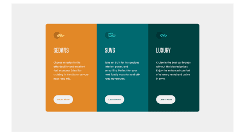
3-column preview card component using HTML and SCSS

@hudarashid
Solution retrospective
Hello, any feedback is welcome :D
Code
Please log in to post a comment
Log in with GitHubCommunity feedback
- @cr1deg0
Hi Huda, looks very good! A few things you may want to revisit to make it even better:
- the Learn More button for the Luxury cars is a bit off compared with the other two.
- have a look into the accessibility issues in the report.
- you could round the corners of the card with border-radius: 12px;
- the background colour is more greyish in the design.
Cheers, Cristina
Marked as helpful

Join our Discord community
Join thousands of Frontend Mentor community members taking the challenges, sharing resources, helping each other, and chatting about all things front-end!
Join our Discord