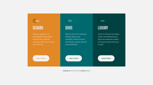
Submitted almost 4 years agoA solution to the 3-column preview card component challenge
3-Column Preview Card | Mobile-First, SASS, Grid
sass/scss

@sheronimo
Solution retrospective
Hi everyone! I didn't struggle much with this component, but once again please let me know If I overlooked anything.
In terms of responsive layout, I set the breakpoint for the cards to stack horizontally at a large screen size (1024px). I found the horizontal layout a little too narrow for my liking at medium screen size (768px), hence why I kept it stacking vertically. I don't have a great eye for design itself, so I'd appreciate any advice/feedback on the layout at medium resolutions. 🌹
Code
Loading...
Please log in to post a comment
Log in with GitHubCommunity feedback
No feedback yet. Be the first to give feedback on shuberber's solution.
Join our Discord community
Join thousands of Frontend Mentor community members taking the challenges, sharing resources, helping each other, and chatting about all things front-end!
Join our Discord