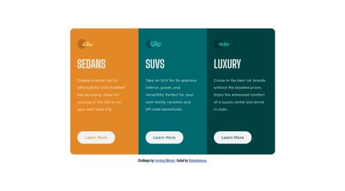
3-column preview card responsive UI

Solution retrospective
Does it look good? Any tips and tricks for responsive UI with less code?
Please log in to post a comment
Log in with GitHubCommunity feedback
- @BenConfig
This looks pretty good. I would perhaps try to simplify the HTML as there seem to be some unnecessary elements.
Maybe something like this:
<main>
    /* Card 1 */
    <section>
        <h2></h2>
        <p></p>
        <a></a>
    </section>

    /* Card 2 */
    <section>
        <h2></h2>
        <p></p>
        <a></a>
    </section>

    /* Card 3 */
    <section>
        <h2></h2>
        <p></p>
        <a></a>
    </section>
</main>
And the images are just for decoration so they can be added using a ::before pseudo-element on each
<section>, instead of an HTML element.Marked as helpful - @AlexKMarshall
Hey there, this looks pretty good. It's responsive and doesn't overflow, which is great.
The HTML is a bit off. You've got a
<section class="main">. Just make that a<main>. You need one anyway, and<section>doesn't have any semantic meaning unless it's labelled with aria.You've got three
<h1>elements. You can only have one of them on the page. That means you'll need to have a hidden page title in an<h1>somewhere, and make the car headings<h2>At some screen-sizes the headings get mis-aligned. I'd probably move the headings up into the
<header>wrapper and that should make it easier to keep them lined up.It's cool that you're experimenting with fluid typography using clamp. It can be a really useful tool. However, for my tastes in this layout it's making things less readable. Generally it's a really useful technique for heading text, less useful for body text. Here I would say your small size of
0.9remis too small. Body copy shouldn't really go below1rem. And on big screens1.94remjust looks too big. Also, having a fluid line-height doesn't make sense here. It will scale with the size of text anyway, so just leave it at1.5or1.25. I think the paragraph text in general would look better at a fixed font-size of1.25rem.I think you could do this with fewer media queries too. You only really need one, which changes the flex-direction of the wrapper from column to row once you get above your breakpoint.
Marked as helpful - @Vicgok
This is so helpful and for the svg I'll try the pseudo method on my next challenge.. Thank you.


Join our Discord community
Join thousands of Frontend Mentor community members taking the challenges, sharing resources, helping each other, and chatting about all things front-end!
Join our Discord