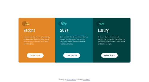
Not Found
Not Found
Not Found
Not Found
Not Found
Not Found
Not Found
Not Found
Not Found
Not Found
Not Found
Not Found
Not Found
Not Found
Not Found
Not Found
Not Found
Not Found
Not Found
Not Found

Submitted

3-column preview card

Scott Wilderā€¢ 120

@Scott-Wilder

Desktop design screenshot for the 3-column preview card component coding challenge

This is a solution for...

  • HTML
  • CSS
1newbie
View challenge

Design comparison


SolutionDesign

Solution retrospective


How did you get the text "sedan, suvs, and luxury" to be as tall? I did a y-axis transfom.

Community feedback

darryncodesā€¢ 6,430

@darryncodes

Posted

Hi Scott,

Great effort here - well done!

As well as the feedback above, your design is jumping slightly when you hover the button. This is because you have added the border property on hover. Move it to the normal styles and it'll fix it.

All the best!

Marked as helpful

0
Vanza Setiaā€¢ 27,855

@vanzasetia

Posted

šŸ‘‹ Hi Scott!

šŸŽ‰ Congratulations on finishing this challenge! I have some feedback on this solution:

  • Accessibility
    • Only have one h1 for every page. Heading one is a unique identifier for each page. In this case, you can have hidden h1 with sr-only styling and make the other heading tags to h2.
    • Heading tag is similar to a title in a document file.
    • There's no need to make the Learn More button as a heading tag.
    • Create a custom :focus-visible styling to any interactive elements (button, links, input, textarea). This will make the users can navigate this website using keyboard (Tab) easily.
    • Always have alt attribute for all img tags. To treat decorative images, you can leave the alt="" empty and add aria-hidden="true" to make all web assistive technologies such as screen reader ignore those images.
    • Wrap all the page content with main tag, except the attribution.
    • For the attribution, you can swap the div with footer tag.
    • Use rem or sometimes em unit instead of px. Using px will not allow the users to control the size of the page based on their needs.
  • Visual
    • The font family for the headings is different from the design.
  • Best Practice (Recommended)
    • Try mobile-first approach when writing your stylesheet, which means instead of using max-width, you'll use min-width instead for the @media query. It often makes me write less code.
    • Use font-size property instead of transform property.
h1 {
  color: hsl(0, 0%, 95%);
  padding: 1rem;
  transform: scale(1, 1.5);
}

That's it! Hopefully, this is helpful!

Marked as helpful

0
DroopyDevā€¢ 80

@droopydev

Posted

Hey Scott! For the buttons, using the native HTML <Button> element is a much suitable choice as it provides a semantic meaning as compared to creating a button using div. I see that you also repeated CSS properties across 3 different classes (.button1 .button2 .button3). A better way is since all three buttons has the same .button class, you can write the same CSS properties (padding: 1em 2em) for that class and it will be applied to all 3 buttons.

Marked as helpful

0

Vanza Setiaā€¢ 27,855

@vanzasetia

Posted

@droopydev Yes, using the button element is better than div, but commonly the if the user clicks the Learn More button, it will navigate the user to a certain page which is what a tag will do.

The button element is used to perform an action, like opening a modal, etc. While link (anchor tag) is used to navigate the user to certain page.

Marked as helpful

1
DroopyDevā€¢ 80

@droopydev

Posted

@vanzasetia You're right, I missed out on the context here for the use case of the button. Great that you point that out. šŸ‘šŸ»

Marked as helpful

0

Please log in to post a comment

Log in with GitHub
Discord logo

Join our Discord community

Join thousands of Frontend Mentor community members taking the challenges, sharing resources, helping each other, and chatting about all things front-end!

Join our Discord