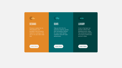
3-column-preview-card

Solution retrospective
Hey Guys! This is my third submission, learned some new things about CSS grid. please comment where I can improve.
Please log in to post a comment
Log in with GitHubCommunity feedback
- @Risclover
Hi Harsh Gupta!
I just did this challenge, too. I took a look at your page. A little bit of a disclaimer - I haven't looked at your code. This is from a visual viewpoint only. :)
Looking at your page initially, it looks good! Obviously, there are some differences here and there between your solution and the original design - your buttons are smaller, your headings are smaller, the spacing is a little different, and you should put in a line height of somewhere around 1.5 to 2 - but all of that is nitpicky, and only matters if you want to get closer to an exact remake.
When I went into the dev tools and started playing with the responsiveness of your page, I started noticing some stuff you should take a look at.
-
The challenge is for us to create a desktop layout and a mobile layout so that the page is "responsive" to different screen displays. The mobile layout they used for their sample was 375px, so when I'm doing these challenges, I base my mobile layout off of a 375px display so I can most closely match theirs, and go from there. Anyway, when you go to 375px with your page, your buttons are way warped in shape - their height and width aren't proportional any more. Other than that, things look good there, too.
-
From around 1000 - 1100px, your display looks odd. It's just too squished. Similarly, when the layout switches over to the mobile layout (at 959px), it looks really off until around, I don't know, 500px or so.
For the record, I did the same thing. I, too, had a desktop and a mobile layout, and my problem was the same - the desktop layout was too squished going down in px, and then when it hit the mobile layout resolution sizes, the layout was way too wide until (scaling down) I hit around 600px or so.
I highly recommend that you do what I did - make an additional media query breakpoint! Pick a chunk of resolution size range and either make it like the mobile layout or the desktop layout, but in a way that looks right for the screen sizes, if that makes sense.
What I did for that "middle" layout was I created a stationary mobile layout, meaning although my elements were responsive for my regular desktop and mobile layouts, once it hit the "middle" mobile layout, it was just one fixed size for a bit until becoming responsive again. Check out my solution to see what I'm talking about if you'd like.
Other than the responsiveness issue, I think you're doing well! Once again I'll mention that I haven't checked out your code, so no guarantees there ;)
Keep it up, fellow newbie!
- Sara
Marked as helpful -

Join our Discord community
Join thousands of Frontend Mentor community members taking the challenges, sharing resources, helping each other, and chatting about all things front-end!
Join our Discord