Not Found
Not Found
Not Found
Not Found
Not Found
Not Found
Not Found
Not Found
Not Found
Not Found
Not Found
Not Found
Not Found
Not Found
Not Found
Not Found
Not Found
Not Found
Not Found
Not Found

Submitted

3-column-preview-card

#accessibility#animation#cube-css
Anointed Kayodeβ€’ 420

@Coderio10

Desktop design screenshot for the 3-column preview card component coding challenge

This is a solution for...

  • HTML
  • CSS
1newbie
View challenge

Design comparison


SolutionDesign

Solution retrospective


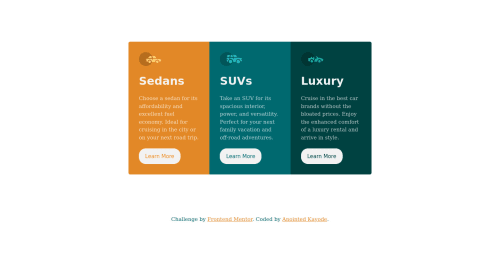
This is the result of the challenge I took. This challenge was quite wonderful and it aspires me to finish all front-end mentor challenges

Community feedback

Lucas πŸ‘Ύβ€’ 104,580

@correlucas

Posted

πŸ‘ΎHello @Coderio10, Congratulations on completing this challenge!

Great code and great solution! I’ve few suggestions for you that you can consider adding to your code:

Your solution seems fine, you did a really good job wrapping the content for these 3 cards. Something you can improve here is to use a single class to manage the content that is mostly the same for the 3 cards (paddings, colors, margins and etc) and another class to manage the characteristics that are different (colors and icon), this way you'll have more control over then and if you need to change something you modify only one class.

✌️ I hope this helps you and happy coding!

Marked as helpful

0

@VCarames

Posted

Hey @Coderio10, some suggestions to improve you code:

  • To center you content to your page, add the following to your Body Element:
body {
    min-height: 100vh;
    display: grid;
    place-content: center ;
}
  • The car images/icons serve no other purpose than to be decorative; They add no value. Their Alt Tag should left blank and have an aria-hidden=β€œtrue” to hides it from assistive technology.

  • The headings are being use incorrectly. For this challenge, each heading is equally as important. So best option, is to use <h2> Heading, because it will give each card the same level of importance and it's reusable.

  • Your "buttons" were created with the incorrect element. When the user clicks on the button they should directed to a different part of you site. The Anchor Tag will achieve this.

  • The correct font-family is not being used. The style guide will have it.

Happy Coding! πŸ‘»πŸŽƒ

0

Please log in to post a comment

Log in with GitHub
Discord logo

Join our Discord community

Join thousands of Frontend Mentor community members taking the challenges, sharing resources, helping each other, and chatting about all things front-end!

Join our Discord