Not Found
Not Found
Not Found
Not Found
Not Found
Not Found
Not Found
Not Found
Not Found
Not Found
Not Found
Not Found
Not Found
Not Found
Not Found
Not Found
Not Found
Not Found
Not Found
Not Found

Submitted

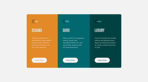
3-column-preview-card-component

Manjiri Phatak• 90

@manjiriphatak

Desktop design screenshot for the 3-column preview card component coding challenge

This is a solution for...

  • HTML
  • CSS
1newbie
View challenge

Design comparison


SolutionDesign

Solution retrospective


Hello. As I am getting more confident in my skills, I would like to know if I am progressing in the right direction. Looking forward to feedbacks

Community feedback

P
Grace• 27,870

@grace-snow

Posted

This is pretty good, well done

Just a few points for improvement :

  • never put text in divs or spans alone. Always use a meaningful element eg paragraph
  • look up how and when to write alt text on images. I think these icons are decorative and therefore should have empty alt or role presentation on them
  • don't capitalise in html, let css text transform take care of that. Remember screenreaders won't be able to Read capitalised text as they will often read them letter by letter thinking they are acronyms
  • never have font size in px. Use rem
  • overall try to use rem more instead of px. This will make sure everything scales together no matter the font size settings someone has
  • it would be more performant to place border radius on the container and give it overflow hidden to make the rounded corners show
  • whenever you include interactive elements, make sure you include clearly visible focus-visible styles as well as hover ones

Good luck

0

Please log in to post a comment

Log in with GitHub
Discord logo

Join our Discord community

Join thousands of Frontend Mentor community members taking the challenges, sharing resources, helping each other, and chatting about all things front-end!

Join our Discord