


バレンタイン 😈• 64,190
@VCarames
Posted
Hey @NamlidN, some suggestions to improve you code:
- Your card is not responsive. You want to use responsive properties and media queries.
Here is a Google Developers link that will teach you how to create responsive designs:
- To give you HTML code structure, you want to set up your code in the following manner (only did parent containers):
<body>
<main>
<article>
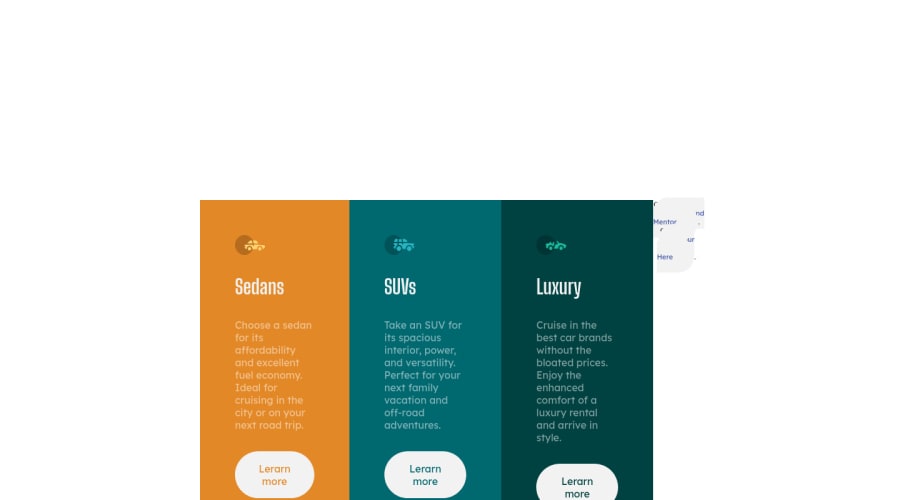
<article class="sedan-card"></article>
<article class="sedan-card"></article>
<article class="luxury-card"></article>
</article>
</main>
</body>
The Main Element identifies the main content of the document.
While the Article Element will serve as the card’s container, because the card represents a complete, or self-contained, section of content that is, in principle, independently reusable.
Lastly, each card will be wrapped in their own Article Element because they too, are complete, or self-contained, section of content that is, in principle, independently reusable.
More info:
https://web.dev/learn/html/headings-and-sections/
- The headings are being use incorrectly. For this challenge, each heading is equally as important. So best option, is to use <h2> Heading, because it will give each card the same level of importance and it's reusable.
Happy Coding! 👻🎃
0

