Skip to content
  • Unlock Pro
  • Log in with GitHub
Solution
Submitted about 4 years ago

3-column-preview-card-component by using html and css in pycharm

Angela Lin•10
@xup6u600504
A solution to the 3-column preview card component challenge
View live sitePreview (opens in new tab)View codeCode (opens in new tab)

Solution retrospective


I didn't figure out some challenges:

  1. how to use rounded corners for just the outline of the combined 3 columns?
  2. why my icons cannot show properly on the website?

Please kindly advise me on solving those problems. If there is anything else I could improve, please also feel free to give me comments. Thank you.

Code
Select a file

Please log in to post a comment

Log in with GitHub

Community feedback

  • Account deletedPosted about 4 years ago

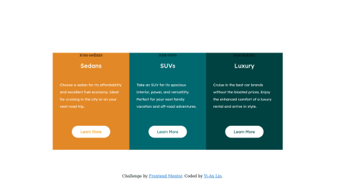
    First I thought it might be because you got the wrong path but you wrote <img scr="images/icon-sedans.svg">, it's supposed to besrc not scr.

  • Irinella B.•80
    @3vilBonobo
    Posted about 4 years ago

    Hi Angela! Here's some feedback on your solution:

    1. As Thulanigamteni already pointed out, you misspelled src in your <img> tabs that's why your images doesn't show up properly.

    2. You can accomplish round corners with "border-radius" CSS property. It can take one value for all four corners or a separate value for each corner, all in pixels. Make sure to use the value both in parent and child elements when needed.

    Also, some further advice to improve your solution:

    • Try to use the correct font family for your headers. -Try to align the elements in each of your cards to the left. Try to adjust the min-max width of your each card so you avoid the bug of them changing size when you hover over the buttons.
    • It's a good practice to begin with an <h1> header and adjust the font size if necessary, using CSS. Header tags have a more semantic meaning than just declaring the size of your fonts. -Try not to use "id" especially in small projects. I know that it kinda makes sense when you have some unique elements but it takes up a lot more memory space than classes and maybe it can make things more complicated than needed. You can always specify you unique element by adding an extra class.

    I hope I helped a little, very nice effort overall! Keep up the good work!

  • Yashasvi Singh•890
    @aUnicornDev
    Posted about 4 years ago

    These 3 items are flex items... and you always want to keep them in a single row. So get rid of flex-wrap as that will push a single item out of the row as it does in viewport <1420px.

    For rounded columns, you can use one of the below

        border-radius: 10px 0px 0px 10px;
    }
    .column3{
        border-radius: 0px 10px 10px 0px;
    }
    
    .flex-container>*:first-child
    {
     border-radius: 10px 0px 0px 10px;
    }
    .flex-container>*:last-child
    {
        border-radius: 0px 10px 10px 0px;
    }
    

Join our Discord community

Join thousands of Frontend Mentor community members taking the challenges, sharing resources, helping each other, and chatting about all things front-end!

Join our Discord

Stay up to datewith new challenges, featured solutions, selected articles, and our latest news

Frontend Mentor

  • Unlock Pro
  • Contact us
  • FAQs
  • Become a partner

Explore

  • Learning paths
  • Challenges
  • Solutions
  • Articles

Community

  • Discord
  • Guidelines

For companies

  • Hire developers
  • Train developers
© Frontend Mentor 2019 - 2025
  • Terms
  • Cookie Policy
  • Privacy Policy
  • License

Oops! 😬

You need to be logged in before you can do that.

Log in with GitHub

Oops! 😬

You need to be logged in before you can do that.

Log in with GitHub

How does the accessibility report work?

When a solution is submitted, we use axe-core to run an automated audit of your code.

This picks out common accessibility issues like not using semantic HTML and not having proper heading hierarchies, among others.

This automated audit is fairly surface level, so we encourage to you review the project and code in more detail with accessibility best practices in mind.

How does the CSS report work?

When a solution is submitted, we use stylelint to run an automated check on the CSS code.

We've added some of our own linting rules based on recommended best practices. These rules are prefixed with frontend-mentor/ which you'll see at the top of each issue in the report.

The report will audit all CSS, SCSS and Less files in your repository.

How does the HTML validation report work?

When a solution is submitted, we use html-validate to run an automated check on the HTML code.

The report picks out common HTML issues such as not using headings within section elements and incorrect nesting of elements, among others.

Note that the report can pick up “invalid” attributes, which some frameworks automatically add to the HTML. These attributes are crucial for how the frameworks function, although they’re technically not valid HTML. As such, some projects can show up with many HTML validation errors, which are benign and are a necessary part of the framework.

How does the JavaScript validation report work?

When a solution is submitted, we use eslint to run an automated check on the JavaScript code.

The report picks out common JavaScript issues such as not using semicolons and using var instead of let or const, among others.

The report will audit all JS and JSX files in your repository. We currently do not support Typescript or other frontend frameworks.

Oops! 😬

You need to be logged in before you can do that.

Log in with GitHub

Oops! 😬

You need to be logged in before you can do that.

Log in with GitHub

Oops! 😬

You need to be logged in before you can do that.

Log in with GitHub