@Kl3va
Posted
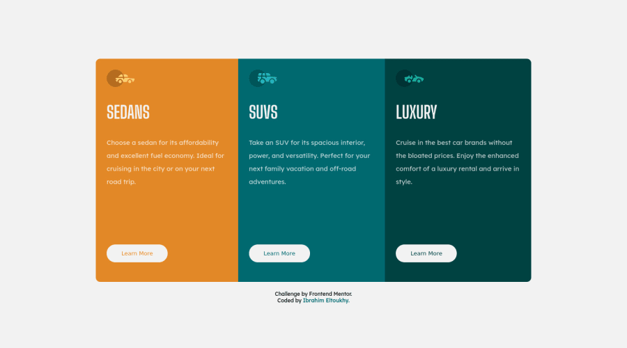
Your solution looks great. The spacing between the text and the button looks much. Don’t know if you would want to reduce it
Marked as helpful
@Ibrahim-Eltoukhy
Posted
@Kl3va yes, I think you're right. Thanks for your observation
Looking to hire developers?
please give me a feedback, that's really helps me.
@migsilva89
Posted
Good job!
I will advise you to use max-width on your body in order to match the challenge, I believe around 1000px will do the job.
The rest looks perfect.
For the accessibility issue please check:
Hope it helps, if so please marked as useful :)
Regards, Miguel Silva
Marked as helpful
@Ibrahim-Eltoukhy
Posted
@migsilva89 thanks a lot
Join thousands of Frontend Mentor community members taking the challenges, sharing resources, helping each other, and chatting about all things front-end!
Join our Discord