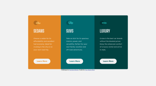
3-column-preview-card-component-main

Solution retrospective
On this one i first tried to make a fluid transition from mobile to desktop with the "clamp" element but didnt turned out well. Any tipps for that?
Otherwise i think this one was managable.
Please log in to post a comment
Log in with GitHubCommunity feedback
- @coding-tomato
Hey! I was fiddling a bit with your website to add the clamp functionality you desired.
I added a little bit of padding in the body tag so the component wouldn't crash against the edges.
body {
  display: grid;
  place-content: center;
  min-height: 100vh;
  padding: 2rem;
}
And of course, I made the main container's width responsive by adding clamp to its width. I used the values shown as an example.
main {
    width: clamp(920px, 100%, 1200px);
    display: flex;
}
You can set something lower like 500px but you'd need to adjust the media query too.
Now, this breaks the site, because now everything is aligned to the left, but you just need to center items in the X axis by adding:
main {
    width: clamp(920px, 100%, 1200px);
    display: flex;
    justify-self: center;
}
Overall very good work! Making things responsive can be tricky, as you can very easily break other elements.
Marked as helpful

Join our Discord community
Join thousands of Frontend Mentor community members taking the challenges, sharing resources, helping each other, and chatting about all things front-end!
Join our Discord