4 Card feature section | By Mike Wilson

Solution retrospective
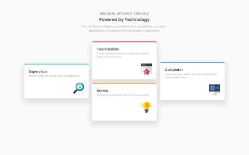
I encountered a few challenges while working with CSS Grid, especially when it came to the desktop view layout. At first, I struggled to understand how to achieve the desired layout, but learning about grid-template-areas helped me precisely place grid items where I wanted them. Initially, I thought I needed to apply max-width to the grid items for proper sizing. However, I realized that using grid-template-columns effectively handles the resizing of elements across different screen sizes without the need for max-width.
Seems like compared to the design in desktop view the width of my elements seem shorter , can't seem to understand how that happened
Please log in to post a comment
Log in with GitHubCommunity feedback
No feedback yet. Be the first to give feedback on Michael Wilson’s solution.
Join our Discord community
Join thousands of Frontend Mentor community members taking the challenges, sharing resources, helping each other, and chatting about all things front-end!
Join our Discord