4 Card Feature Section (Vanilla CSS + Custom Design + Glassmorphism)
Solution retrospective
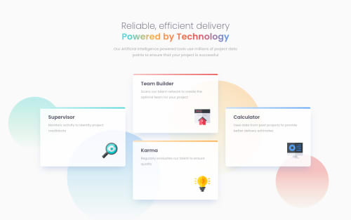
👾 Hello, Frontend Mentor coding community. This is my solution to the Four Card Feature Section.
😎 I had a lots of fun doing the challenge and doing some custom design improvements.
This is a solution that I've finished before but I decided to update it, when I saw a solution of guy Yefry Sanchez where he applied an hover effect on the card where the icon flips while hovered, so I tried to apply something similar to mine inspired on what he did. Here's is his profile @y25sanchez . Nice solution bro!
👻 I added some features 💀
- 🎨 Text Gradient on main heading.
- 🥃 Glassmorphism on card hover.
- 🎨 Custom background.
Feel free to leave any feedback.
Please log in to post a comment
Log in with GitHubCommunity feedback
- @felipejesus-front
@correlucas
Sempre que eu termino um desafio eu venho ver a sua solução e SEMPRE acho q fiz algo errado kkkk vc sempre deixa 500% melhor que o original, muito fera, inspira muito!
Marked as helpful - @ExploryKod
Great job, I love it: it improve the interaction with the user, the initial design was a little too static whereas these cards are there to call us into action, make us paying attention to them. Glassmorphism is a very good technique, I will remember it. Thanks for sharing this inspiration.
To improve it even better, why do the pointer stay identical ? May be I am wrong but if these cards contains links to another part of the website, it would be good to create a cursor pointer on the right element. However, I might be wrong and these cards may not be links. 👏🏾👏🏾
Marked as helpful - @elaineleung
So glad you updated it, love the spinning icons, which I definitely will borrow later (thank you also to Yefry!)
In this work I just love how you made slight changes to the existing design instead of doing something completely different. In a sense it's improving the original design also. I'm really not a fan of the SVG backgrounds in so many of these designs because firstly, positioning them takes a lot of time to get right and is no fun, but more importantly, they usually are super poor in contrast against the background, and it's so hard to even see where they are, let alone trying to position them. I think the circles you added in the background actually makes everything pop a bit more; I'm usually complaining about those SVGs and wish they're not there, and yet in this design (which is one of the very few that doesn't have a background) I think the SVGs you added make it look better, especially with the opacity on the card.
Well done once again! 👏
Marked as helpful - @emadbakry
omg i see it is even better than the normal one, i hope i am not bothering if i asked about the time you spent to be at this level, am i?
and i have a small idea that might make the design more modern it is about using @keyframe to Animate those little icon (like infinit up and down animation using transformY) do not use margin for animating things, if you like the idea i would be happy to see the changes, thanks.
Marked as helpful - @AdrianoEscarabote
Fiquei dois dias fora, e você já lança dois projetos top.
Gostei muito das imagens de fundo, deu uma preenchida bem legal na página. As Animações que você colou nas imagens, a opacidade do card diminuindo com o efeito hover… tudo fantástico.
Não tem muito o que falar hauhauaha
Parabéns, evoluindo como sempre não tem jeito!
Marked as helpful - @chukwudobe-Micah
Okay then, I'll try to tail you with these animation effects and your feedbacks will be very helpful and appreciated. <3 And also, I feel you must have had somewhere where you learnt these different effects and got the ideas from, can you share? And also, if you make a container card flip, does the whole content in the container flip?
- @chukwudobe-Micah
Wow, this is just too much. Really great work. And also, do you write all your animations yourself? Or you use animate.css sometimes.
- @devnnga
@correlucas can you share your source code please? Been trying to understand how to make that layout. Thanks
- @shaswatsingh19
Another one of your great art I would say. Can I use your design to build the project if you don't mind?
- @johnnysedh3lllo
intuative as always. great job, Lucas. 👏🏼
- @BrunoleonardoDev
Show ! 👏🏾👏🏾
- @mverma45
wow good job lucas looks amazing.
- @Raja-Junaid
Hi Lucas! Congratulation on completing this beautiful and unexpected challenge. I clap for you 🙌. You put so much hard work and time as seen in your design section. I really like this solution.
There is 0 ACCESSIBILITY ISSUES and 0 HTML ISSUE. It opened my eye's when I see your solution. And your code is also neat and clean.
VERY APPRECIATED!
Join our Discord community
Join thousands of Frontend Mentor community members taking the challenges, sharing resources, helping each other, and chatting about all things front-end!
Join our Discord