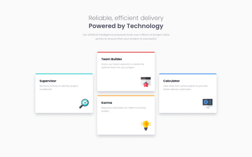
4 Feature Card Section built using CSS Grid & Flexbox

Solution retrospective
I'm glad I was able to finish this design, but I wasn't satisfied of my solution. Also, one thing I've been confused at is the scrollbar. What I did on this project was add padding on the body element to have scrollbar effect, but I'm not sure if that was the best practice. Can you give me some tips or advice? Thanks!
Please log in to post a comment
Log in with GitHubCommunity feedback
- @mubizzy
Excellent job on this challenge! your report has a few issues though:
- wrap everything in your body in
<main>or use semantics
2. it is a best practice to use both HTML 5 and ARIA landmarks to ensure all content is contained within a navigational region.
Hope it helps:)...don't forget to mark it as helpful 👍
You can get more details here...click here
Marked as helpful - wrap everything in your body in
- P@james-work-account
Looks great!
Something to consider, why did you put min-widths on your
.featureand.containerelements? Any people with phones below ~400px wide (e.g. iPhone 13 mini) will experience horizontal overflow, which is something you'd generally want to avoid.Also, consider moving away from px for widths/heights/font-sizes/etc and switching to using rem for this. There are a few articles explaining why you'd want to do this (e.g. this one) - there are online px-to-rem converters if you want to make your life easier.
Marked as helpful


Join our Discord community
Join thousands of Frontend Mentor community members taking the challenges, sharing resources, helping each other, and chatting about all things front-end!
Join our Discord