Skip to content
  • Unlock Pro
  • Log in with GitHub
Solution
Submitted almost 4 years ago

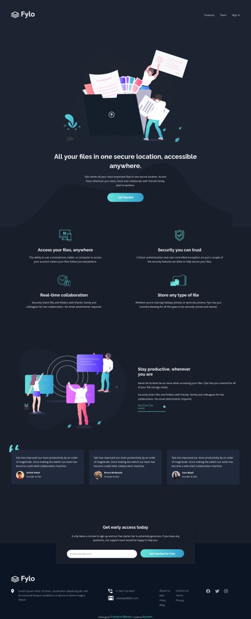
A Mobile first Responsive landing page using scss and flex-box & grid.

talentlessDeveloper•340
@talentlessDeveloper
A solution to the Fylo dark theme landing page challenge
View live sitePreview (opens in new tab)View codeCode (opens in new tab)

Solution retrospective


Spent time trying to get the right html structure. Also really lacking in accessibility properties, an area I'm looking forward to improving on.

Code
Select a file

Please log in to post a comment

Log in with GitHub

Community feedback

  • P
    Dave•5,295
    @dwhenson
    Posted almost 4 years ago

    Hey @talentlessDeveloper (nice name - I have no talent either, but I find persistent hard work and luck makes up for this!). Lovely job here 🙌

    Here's some comments focused on the HTML as that is what you are working on:

    • I'm not sure you need to wrap your logo in a figure element, or many of the other images. You can just add the img directly

    • For your alt text, please remember that this will be read out by screen readers so the text should describe the image. It shouldn't be a file name/class descriptor like you have.

    • I think that your button in the first intro section should be a link. It's worth having a google and reading up on the difference between a and button elements.

    • Inside your features section, I would suggest that you might consider putting these items in a ul rarther than a div. This will announce to people using assistive tech how many items then can expect.

    • Similarly for the testimonials, you could consider wrapping these in a ul as well for the same reasons.

    • In the form, I would consider adding the novalidate attribute to the form using JS, that way if JS fails for any reason, you can fall back to the browser validation.

    • I would put the list of links to other pages in the foooter inside a nav element. It's fine to have more than one on a page.

    Aside from the basics of alt attributes on your images, and not removing outline properties (or adding a styled alternative) I wouldn't worry at this stage about accessibility too much at this stage. If you focus on getting the right HTML element for the job, you are already 90% of the way there. Once you have that down you can go on to think about some of the finer points...

    Hope this helps - Lovely job over all 👍

    Cheers 👋

    Dave

    Marked as helpful
  • Fidel Lim•2,775
    @fidellim
    Posted almost 4 years ago

    Hi!

    Great work finishing the project! Just a suggestion I would like to share, you can change the media query width of your footer from around 640px to 760px, the site is not responsive. This is because the social icons on the footer prevent the footer from shrinking.

    I hope it helps :)

    Marked as helpful

Join our Discord community

Join thousands of Frontend Mentor community members taking the challenges, sharing resources, helping each other, and chatting about all things front-end!

Join our Discord
Frontend Mentor logo

Stay up to datewith new challenges, featured solutions, selected articles, and our latest news

Frontend Mentor

  • Unlock Pro
  • Contact us
  • FAQs
  • Become a partner

Explore

  • Learning paths
  • Challenges
  • Solutions
  • Articles

Community

  • Discord
  • Guidelines

For companies

  • Hire developers
  • Train developers
© Frontend Mentor 2019 - 2025
  • Terms
  • Cookie Policy
  • Privacy Policy
  • License

Oops! 😬

You need to be logged in before you can do that.

Log in with GitHub

Oops! 😬

You need to be logged in before you can do that.

Log in with GitHub

How does the accessibility report work?

When a solution is submitted, we use axe-core to run an automated audit of your code.

This picks out common accessibility issues like not using semantic HTML and not having proper heading hierarchies, among others.

This automated audit is fairly surface level, so we encourage to you review the project and code in more detail with accessibility best practices in mind.

How does the CSS report work?

When a solution is submitted, we use stylelint to run an automated check on the CSS code.

We've added some of our own linting rules based on recommended best practices. These rules are prefixed with frontend-mentor/ which you'll see at the top of each issue in the report.

The report will audit all CSS, SCSS and Less files in your repository.

How does the HTML validation report work?

When a solution is submitted, we use html-validate to run an automated check on the HTML code.

The report picks out common HTML issues such as not using headings within section elements and incorrect nesting of elements, among others.

Note that the report can pick up “invalid” attributes, which some frameworks automatically add to the HTML. These attributes are crucial for how the frameworks function, although they’re technically not valid HTML. As such, some projects can show up with many HTML validation errors, which are benign and are a necessary part of the framework.

How does the JavaScript validation report work?

When a solution is submitted, we use eslint to run an automated check on the JavaScript code.

The report picks out common JavaScript issues such as not using semicolons and using var instead of let or const, among others.

The report will audit all JS and JSX files in your repository. We currently do not support Typescript or other frontend frameworks.

Oops! 😬

You need to be logged in before you can do that.

Log in with GitHub

Oops! 😬

You need to be logged in before you can do that.

Log in with GitHub