a modern CSS Framework like Bootstrap or Foundation.

Solution retrospective
Proud of: I’m most proud of completing the Blogr landing page project with a fully responsive design across desktop and mobile views. I paid close attention to layout, typography, and visual balance, ensuring consistency with the original design mockup. I also utilized modern CSS techniques like Flexbox and Grid efficiently, improving structure and responsiveness.
What I’d do differently: Next time, I would manage my file organization and naming conventions better to keep the project more scalable and maintainable. I also realized I could improve performance by optimizing images and using semantic HTML more consistently. Additionally, incorporating accessibility features such as aria labels and proper contrast ratios would make the website more inclusive.
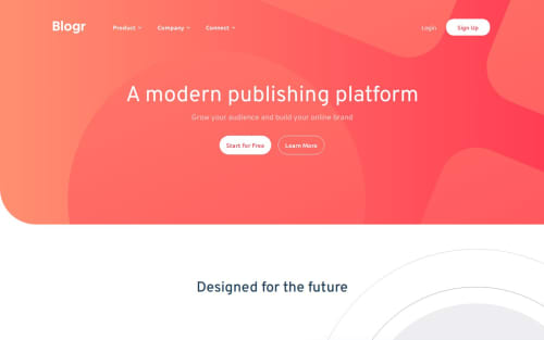
What challenges did you encounter, and how did you overcome them?One of the main challenges I faced was making the navigation bar responsive, especially with the mobile hamburger menu. It was tricky to toggle the menu smoothly and ensure that dropdown links worked well across devices. I overcame this by reviewing documentation on responsive design patterns and testing with media queries and JavaScript event listeners until the behavior was consistent.
Another issue was aligning elements precisely as shown in the design mockup. Getting the background images and overlapping SVGs to appear correctly was difficult due to positioning conflicts. I resolved this by experimenting with absolute positioning and adjusting z-index layers carefully.
Lastly, I encountered a few browser compatibility issues, especially with flex and grid layouts behaving differently in Safari. I used browser-specific testing tools and fallback CSS properties to make sure the layout remained consistent.
What specific areas of your project would you like help with?I’d appreciate feedback on the following areas:
Navigation menu toggle (JavaScript logic) – I’m unsure if my current method for showing/hiding the mobile navigation is the most efficient or accessible. Are there cleaner or more accessible ways to handle this?
Responsive layout spacing – I struggled to maintain consistent padding and spacing between sections across breakpoints. Suggestions on improving spacing responsiveness without hardcoding values would be helpful.
CSS organization – I’d love input on how to better structure my CSS for scalability. Right now, my styles are functional but feel a bit messy and hard to manage.
Accessibility – Are there specific accessibility issues in my markup or missing semantic elements that I should address?
Performance optimization – The page loads fine, but I didn’t optimize images or minify CSS. I’d like advice on best practices for optimizing performance without overcomplicating the build process.
Please log in to post a comment
Log in with GitHubCommunity feedback
No feedback yet. Be the first to give feedback on SuzalV's solution.
Join our Discord community
Join thousands of Frontend Mentor community members taking the challenges, sharing resources, helping each other, and chatting about all things front-end!
Join our Discord