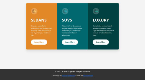
a responsive 3-column preview card component using Bootstrap

Solution retrospective
Completing this challenge i also do an enhancement on it by: Here are the key enhancements I've made:
Smooth Transitions: Added a --transition-time variable for consistent transition durations. Applied transitions to various elements (cards, icons, text) for smooth hover effects. Expanding Cards on Click: Added an expanded-content div within each card for additional information. Implemented JavaScript to toggle an expanded class on card click. Created CSS rules to show/hide expanded content and apply visual changes when expanded. Enhanced Interactivity: The cards now have a cursor: pointer style to indicate clickability. When expanded, the card's title becomes larger, and the icon scales up slightly. Responsive Behavior: The expanding functionality works on both desktop and mobile devices. The layout remains responsive, adapting to different screen sizes. Accessibility: The interactive elements are keyboard-accessible.
What challenges did you encounter, and how did you overcome them?Nah
What specific areas of your project would you like help with?I am open to learning.
Please log in to post a comment
Log in with GitHubCommunity feedback
No feedback yet. Be the first to give feedback on Solomon Obanijesu Philip's solution.
Join our Discord community
Join thousands of Frontend Mentor community members taking the challenges, sharing resources, helping each other, and chatting about all things front-end!
Join our Discord