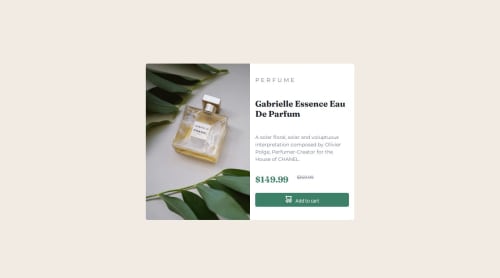
A responsive card component that previews a product.

Solution retrospective
I successfully implemented a responsive design using media queries. The layout adjusts seamlessly between mobile and desktop versions, providing an optimal user experience on various devices. I used Flexbox to align elements effectively, making the layout flexible and easy to manage across different screen sizes. I added a hover effect to the "Add to cart" button, which improves user interactivity and makes the UI feel more dynamic.
What challenges did you encounter, and how did you overcome them?One challenge was handling image sizes for different screen resolutions. Although I used the element to load different images for mobile and desktop, I’m still exploring how to optimize image loading for better performance (e.g., using WebP format).
What specific areas of your project would you like help with?Explore more advanced CSS techniques like CSS Grid for layout control in complex designs, which could give me even more flexibility compared to Flexbox alone.
Please log in to post a comment
Log in with GitHubCommunity feedback
No feedback yet. Be the first to give feedback on Ataize Feitosa's solution.
Join our Discord community
Join thousands of Frontend Mentor community members taking the challenges, sharing resources, helping each other, and chatting about all things front-end!
Join our Discord