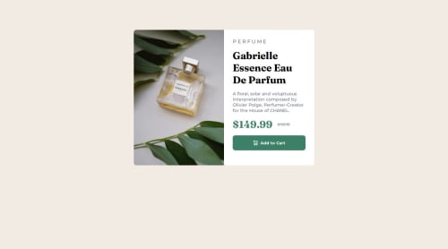
Submitted 4 months agoA solution to the Product preview card component challenge
A responsive product preview card component
pure-css

@lutfiismail52
Solution retrospective
What are you most proud of, and what would you do differently next time?
I want to try using the HTML <picture> tag to display different images for different screen widths.
What specific areas of your project would you like help with?Is my approach of displaying different images for different screen sizes by using two different image elements and then setting which one to display for a given screen width correct? Or is there a better and more efficient way. Here is the code:
<div class="container">
  <img class="image1" src="images/image-product-mobile.jpg" alt="a parfume" />
  <img class="image2" src="images/image-product-desktop.jpg" alt="a parfume" />
  <div class="wrapper">
  </div>
</div>
@media screen and (min-width: 768px) {
  .image1 {
    display: none;
}

  .image2 {
    display: block;
    width: 50%;
    border-top-left-radius: 8px;
    border-bottom-left-radius: 8px;
}
}
Thank you very much for your answer and explanation. I really appreciate your time and effort in helping me! 😊
Code
Loading...
Please log in to post a comment
Log in with GitHubCommunity feedback
No feedback yet. Be the first to give feedback on Lutfi Ismail's solution.
Join our Discord community
Join thousands of Frontend Mentor community members taking the challenges, sharing resources, helping each other, and chatting about all things front-end!
Join our Discord