Submitted almost 3 years agoA solution to the Product preview card component challenge
A solution for the Product Preview Card Component Challenge

@Salah1221
Code
Please log in to post a comment
Log in with GitHubCommunity feedback
- @klievanskyi
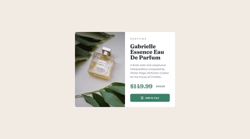
Hey @Salah1221!
Good job! Looks great and is very similar to the design.
I have a couple of suggestions to improve your solution.
- It's not semantic to use
ulandlitags to wrap the product card. Better to replace it withdiv. - It's better to use
buttontag because a user will not redirect to another page after clicking. The central role of such cards is to add products to a bucket. - You could remove the optical view version of the font. It's the main reason why the title is not the same as the design on the screenshot.
I hope my notice will help you.
Marked as helpful - It's not semantic to use

Join our Discord community
Join thousands of Frontend Mentor community members taking the challenges, sharing resources, helping each other, and chatting about all things front-end!
Join our Discord