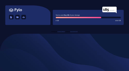
Submitted over 4 years agoA solution to the Fylo data storage component challenge
absolute, flex, pseudo

@dod123-stack
Solution retrospective
I faced some issues doing this challenge, if you know better way to do it or some suggestions to improve my code please let me know.
Code
Loading...
Please log in to post a comment
Log in with GitHubCommunity feedback
No feedback yet. Be the first to give feedback on Doaa's solution.
Join our Discord community
Join thousands of Frontend Mentor community members taking the challenges, sharing resources, helping each other, and chatting about all things front-end!
Join our Discord