Skip to content
  • Unlock Pro
  • Log in with GitHub
Solution
Submitted over 1 year ago

Accessible Accordion with Pure JavaScript
accessibility
Paulo Vitor Ferreira Gonçalves Pivotto•40
@high-rolls
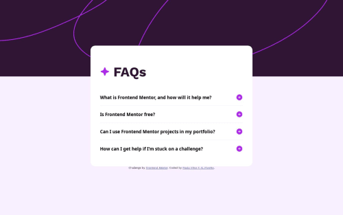
A solution to the FAQ accordion challenge
View live sitePreview (opens in new tab)View codeCode (opens in new tab)

Solution retrospective


I couldn't get the <main> element to correctly center horizontally on the screen, it is slightly offset to the right. This is especially noticeable on small screen widths. If anyone knows why this happens I'd be grateful to learn it.

Code
Select a file

Please log in to post a comment

Log in with GitHub

Community feedback

  • P
    Øystein Håberg•13,280
    @Islandstone89
    Posted over 1 year ago

    It looks OK for me, too. But I don't recommend setting a fixed width, that usually does more harm than good. So I would at least change width to max-width - this will allow it to shrink if needed.

    A few other things I noticed...

    HTML:

    • Headings must always be in order, so you should not jump from <h1> to <h3>. Hence, I would change all instances of <h3> into <h2>.

    • Footer text must be wrapped in a <p>.

    CSS:

    • You don't need to give the body a width of 100vw, as that is its default width anyway.

    • Similarly, the default root font size is 16px, so no need to declare it. Remember, though, font-size must never be in px. This is bad for accessibility, as it prevents the font size from scaling with the user's default setting in the browser. Use rem instead.

    • It is common to do mobile styles first, as its layout is usually less complex. This means setting min-width media queries, and they should be in rem.

    • You are giving main a box-sizing: border-box on smaller screens. box-sizing: border-box is usually set on all elements, like this:

    *,
    *::before,
    *::after {
      box-sizing: border-box;
    }
    

    This is usually done at the top of the stylesheet, as part of a CSS Reset. I would recommend including it every time - I use this CSS Reset by Andy Bell.

    Marked as helpful
  • Jack Smith•350
    @Clonephaze
    Posted over 1 year ago

    Solution looks good! I looked at the page, played around with it in responsive design mode at various sizes, and looked at your code for centering. Everything seems fine, on my screens everything is properly centered. Maybe a scrollbar was popping up and shifting things?

    My one recommendation would be to set your width to something more like "width min(350px, 90vw)". min() is a fun one, allowing contents to adjust for different conditions. It was always choose the smallest value to work with, in this case it would allow your main content to take up to 90 percent of the width of the screen but never appear smaller than 350px. Responsive widths like that are great for designing content that can adapt to various screen sizes without needing to specify widths at specific viewport sizes.

    Marked as helpful

Join our Discord community

Join thousands of Frontend Mentor community members taking the challenges, sharing resources, helping each other, and chatting about all things front-end!

Join our Discord

Stay up to datewith new challenges, featured solutions, selected articles, and our latest news

Frontend Mentor

  • Unlock Pro
  • Contact us
  • FAQs
  • Become a partner

Explore

  • Learning paths
  • Challenges
  • Solutions
  • Articles

Community

  • Discord
  • Guidelines

For companies

  • Hire developers
  • Train developers
© Frontend Mentor 2019 - 2025
  • Terms
  • Cookie Policy
  • Privacy Policy
  • License

Oops! 😬

You need to be logged in before you can do that.

Log in with GitHub

Oops! 😬

You need to be logged in before you can do that.

Log in with GitHub

How does the accessibility report work?

When a solution is submitted, we use axe-core to run an automated audit of your code.

This picks out common accessibility issues like not using semantic HTML and not having proper heading hierarchies, among others.

This automated audit is fairly surface level, so we encourage to you review the project and code in more detail with accessibility best practices in mind.

How does the CSS report work?

When a solution is submitted, we use stylelint to run an automated check on the CSS code.

We've added some of our own linting rules based on recommended best practices. These rules are prefixed with frontend-mentor/ which you'll see at the top of each issue in the report.

The report will audit all CSS, SCSS and Less files in your repository.

How does the HTML validation report work?

When a solution is submitted, we use html-validate to run an automated check on the HTML code.

The report picks out common HTML issues such as not using headings within section elements and incorrect nesting of elements, among others.

Note that the report can pick up “invalid” attributes, which some frameworks automatically add to the HTML. These attributes are crucial for how the frameworks function, although they’re technically not valid HTML. As such, some projects can show up with many HTML validation errors, which are benign and are a necessary part of the framework.

How does the JavaScript validation report work?

When a solution is submitted, we use eslint to run an automated check on the JavaScript code.

The report picks out common JavaScript issues such as not using semicolons and using var instead of let or const, among others.

The report will audit all JS and JSX files in your repository. We currently do not support Typescript or other frontend frameworks.

Oops! 😬

You need to be logged in before you can do that.

Log in with GitHub

Oops! 😬

You need to be logged in before you can do that.

Log in with GitHub