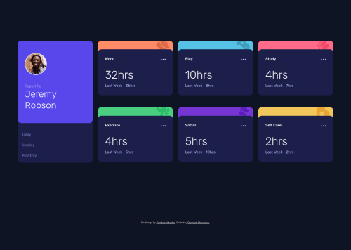
Activity Dashboard with Grid

Solution retrospective
Hello, any suggestions and feedback is very welcomed since I spent 4 days on this project I had a lot of problems with positioning the layout on card with transform property Could you please check my code and tell me where I could improve and where I'm using some bad practices as well? What would you use to align the two parts of the cards(like the orange, blue, pink etc.) to be as in the design, I've struggle a lot with it and I know I used a very bad practice just to get it done already! Please help me improve :) Thanks
Please log in to post a comment
Log in with GitHubCommunity feedback
- @pikapikamart
Hey, really nice work on this one. The desktop layout looks really great, the site is responsive as well and I like that layout when you go tablet size, looks really nice to be honest. Mobile state looks great as well.
Here are some suggestions for the site:
- For this one, you should replace the
articletag into usingmaintag since amaintag is needed for a page so that it will be easy for user to know the main-content since they could just traverse the landmark. - Inside the
.gridselector, you could change eachsectionto justdiv.sectiontag is not that informative as landmark element unless you usearia-labelledbyon it so that screen-reader will read an extra information about the landmark.divwould be fine since traversing by the heading tag is the same when you just use a plainsectiontag. - I noticed that each of the
.cardselector has a smallheight, you can see that if you hover when inspecting the layout. For this one, theheightis not really needed on each.card. What you can do is that, each icon on the top part of the.cardcould just be used asbackground-imagefor each.cardselector, this way you could just add apadding-topon it to simulate the dark-ish container below it to be pushed below. - If you insist on using
imgtag, then usealt=""and addaria-hidden="true"on it since it is only a decorative image. - Since you used
buttonon the 3 dots, you should have eitheraria-labelattribute orsr-onlytext inside it which defines what thebuttondoes. - The 3 dots
imgis decorative as well, hide it using the method above. - Do not remove the
outlinestyling. If you did, always include a visual-indicator on the:focus-visiblefor those interactive elements like thebuttonatag and others. - Since you are using a
buttontag on this one, you could use aultag to wrap thosebuttonsince those are "list" of selections. - Also, since
buttonalone is not informative specially when a user toggles it using a screen-reader, you should have used either anaria-liveelement that will announce whether a specificbuttonhas been toggled. Another approach would be to use something likearia-pressedon eachbutton, you set the attribute totrueif abuttonis pressed and for others as well. - Lastly, the
.attributionshould be using afootertag so that it will be its own landmark element.
Aside from those, great job again on this one.
Marked as helpful - For this one, you should replace the

Join our Discord community
Join thousands of Frontend Mentor community members taking the challenges, sharing resources, helping each other, and chatting about all things front-end!
Join our Discord