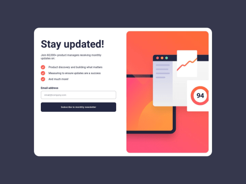
Advanced grid and flexbox tools are used.

Solution retrospective
The perfect solution in a grid.
Almost without the need for media query except for two lines.
And this is because of advanced techniques such as auto-fit etc.
The BEM methodology is used.
Live site URL: https://sass-sass.netlify.app/
Repository: https://github.com/daniel-barda/Frontendmentor-Newsletter
Please log in to post a comment
Log in with GitHubCommunity feedback
- P@dev-ethanjohn
Nice work!
I have some few issues that I encountered though but can be easy fix. There is an inconsistent spacing and margin around the newsletter main content when changing breakpoints. I know we wouldn't have to always need media queries for a lot of things, but in this case, you can apply some and mix it with responsive dimensions like using calc() or minmax() for your container's width. I also noticed that the email input does not bind with the confirmation message, but no worries that will be easy with DOM manipulation. Overall, good job for taking the challenge!

Join our Discord community
Join thousands of Frontend Mentor community members taking the challenges, sharing resources, helping each other, and chatting about all things front-end!
Join our Discord