Not Found
Not Found
Not Found
Not Found
Not Found
Not Found
Not Found
Not Found
Not Found
Not Found
Not Found
Not Found
Not Found
Not Found
Not Found
Not Found
Not Found
Not Found
Not Found
Not Found

Submitted

Advice Generator app

Kam 50

@novatok

Desktop design screenshot for the Advice generator app coding challenge

This is a solution for...

  • HTML
  • CSS
  • JS
  • API
2junior
View challenge

Design comparison


SolutionDesign

Solution retrospective


I had trouble centering the dice in this project. I ended up using position: absolute but even left of 50% still did not center it. Any advice on what I can do better for the next project?

Community feedback

Shiva 670

@shivaprakash-sudo

Posted

Hello Kam,

Congrats on finishing the challenge!

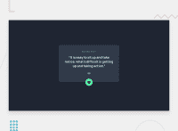
Regarding the button centering, you can use bottom: -Mpx;, where M is the necessary number of pixels required to centre the button horizontally.

Few points to note:

  • Advice API caches the the data for 2 seconds, so please put { cache: "no-cache" } as the second argument inside the fetch statement. This is necessary because without this, the app doesn't work in Firefox and in other browsers we need to wait few seconds to get new advice.
  • For advice and adviceId, you don't need to use span element, you can give those ID names to the parent elements themselves.
  • Also, <br> is not necessary here, since h1 is already a block element and next element comes under it.

Good luck on your next projects.

Marked as helpful

1
Elaine 11,420

@elaineleung

Posted

Hi Kam, good attempt at working on this challenge! About centering the dice icon, the way to set it is firstly to give it a declaration of left: 50%, and then a negative margin that is half the width of the dice, which gives 27.5px (55px / 2):

button {
  left: 50%;
  margin-left: -27.5px;
}

I made the changes via the inspector and I can see it fairly centered in desktop view, but in mobile view it looks like the divider line is not centered, and so the dice also looks off center. I see you using a position: absolute on the divider; I would just remove that and use margins instead to position it. You can have a look at my solution here for ideas: https://www.frontendmentor.io/solutions/responsive-component-with-api-and-data-fetching-acBCRNQ6R9. Good luck!

Marked as helpful

0

Please log in to post a comment

Log in with GitHub
Discord logo

Join our Discord community

Join thousands of Frontend Mentor community members taking the challenges, sharing resources, helping each other, and chatting about all things front-end!

Join our Discord