


@romila2003
Posted
Hi Cassidy,
Congratulations 🎉 for completing this challenge, it was a great attempt. The Advice generator looks good and is functional.
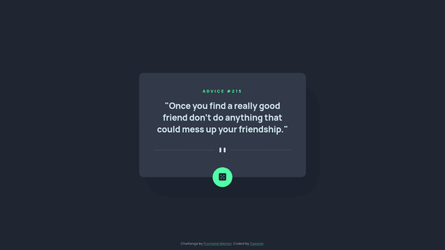
When your card is 600px or lower, you should remove the padding-top property and justify-content property which will automatically align to the center as the body has the flex property. Also, it would be best practice to take the mobile-first approach rather than the desktop-first approach since it would be easier to change or rearrange the elements as you increase the screen size.
Overall, great attempt and wish you the best for your future projects 👍.
Marked as helpful
@romila2003 Thanks for your feedback! I agree that centering the card would be better for mobile. In the design for mobile the space at the bottom was roughly double the space at the top, which was why I didn't center it. I definitely need to practice doing mobile-first more as I've always done desktop and then worked my way down. Thank you for commenting, I really appreciate it!
