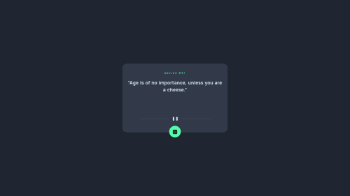
Not Found
Not Found
Not Found
Not Found
Not Found
Not Found
Not Found
Not Found
Not Found
Not Found
Not Found
Not Found
Not Found
Not Found
Not Found
Not Found
Not Found
Not Found
Not Found
Not Found

Submitted

Advice_Generator API

#fetch

@DeanFHardy

Desktop design screenshot for the Advice generator app coding challenge

This is a solution for...

  • HTML
  • CSS
  • JS
  • API
2junior
View challenge

Design comparison


SolutionDesign

Solution retrospective


I attempted to build the Mobile design version first and it made things a little confusing for me when I attempted to add in the responsiveness once the Mobile design was complete.

If anyone has any tips or tricks on a Mobile First approach, please share.

Is it a good idea to have your project open and adjusted to the screen width recommened in the ReadMe (i.e 375px for Mobile) whilst you code ?

Thanks.

Community feedback

@pikapikamart

Posted

Hey, nice work on this one. The desktop layout looks good, however layout issues appears when resizing the browser from desktop view to mobile view as the layout is not responsive. Also, when you zoom out on your end, the components gets huge.

Ivan already gave great feedback on this one, just going to add some as well:

  • Yep, when you code mobile first, resizing the browser using dev tools into a phone's size should always be done so that you'll really see the layout being shown into that size. Actually at first, I find it a bit confusing to do mobile first, but some challenges taken, i'm sure that you'll get the hang of it.
  • Never use position absolute a large container on your site, on your end, using it on the main tag. The reason for this is that, position: absolute removes the element from the flow, if the container doesn't have explicit sizes, it makes the container doesn't "capture" the child element. Try to inspect your site in dev tools, hover on the body tag, you'll notice that it doesn't have any size because its child element is being absolute. For this one, you can just remove all these stylings on the main tag:
position
top
left
bottom
right
margin
width
height

Then to properly center the content, add these first on the body tag:

  align-items: center;
  display: flex;
  justify-content: center;
  min-height: 100vh; # makes sure that it has sufficient height
  padding: # add some to prevent component touching the sides of the browser
  place-content: center;

Then again on the main tag, you can just add:

  flex-basis: 100%;
  max-width: 500px; # convert to rem and change the size depends on the design;

This makes the component more responsive. You can add min-height on the main as well if you want if you like a more consistent sizing.

  • Now, if you follow those above, you will notice that some or lots of element are being out of place because those elements are using the same stylings on the main. Again, remove all those stylings I mentioned earlier on each element and let the main container handle their positioning. If you need to place elements, don't always jump to position: absolute this should be the last case you want. Try searching or maybe looking up other website's submission as well to get some ideas when you are coding :>
  • Do not use id attributes to target an element on your css, using id creates problem due to specificity, always use class so that it could be more manageable and reusable.
  • As you may know, an h1 is needed for every webpage, the h1 describes the main content per each page. On this one, since there are no visible h1 on the page, the h1 will be instead a screen-reader only h1. Meaning, it won't be seen visually, but it is there. Have a look at this simple fiddle that I have about screen-reader text. Comments are already included, but if you have any queries, just let me know okay.
  • Instead of h4, use h2 on the "Advice" text. When you are using heading tags, make sure that they are on the proper level, when you use h4, make sure that h1, h2, h3 are all present before the h4.
  • When you need to make a text capitalized, you don't write them as it is like "ADVICE" on the html, this will make screen-reader read the word letter-by-letter and not by word. Use lowercase on them and just use text-transform: uppercase on the css.
  • If you want to align those items inside the main tag in the center, you can add:
align-items: center;
display: flex;
flex-direction: column;

On the main tag.

  • Remember when using img tag, always add an alt attribute. When you don't include it, screen-reader will instead announce something different from the file path. So always include it.
  • Since the divider img is just being used as decoration, adding alt="" and aria-hidden="true" on it would be nice. This makes the img tag be hidden for screen-readers as they are not really meaningful content of the site, always use this when image are not informative.
  • Instead of input, using button would be much better and correct for this one since input are used inside of form right.
  • Using button on that one, I would suggest the .circle selector to be the actual button, just style it to be circular. Also, since there are no visible text on that button ( if you used ), you should always add a label-text on it on what the button is supposed to do. For example, you can add aria-label="Change quote text". This way, when user traverses the button using screen-reader, they will be notified on what this button does.
  • If you are new to some of these ideas, maybe adding more will be confusing right now. But some ideas to make the app more accessible would be, shifting focus on the quote after the button is toggled or an alternative, aria-live would be use on the quote so that it will be easier to maintain response.

Those might be lot but you'll encounter them on your way. Just let me know if you need help and see if I can help. Again, great job for this one.

Marked as helpful

1

@DeanFHardy

Posted

@pikapikamart Thanks so much for the lenghty and valuable feedback friend. I will make the necessary edits and additions to the code over the next few days for a better end product. Such valuable feedback. Thanks again.

1
Ivan 2,630

@isprutfromua

Posted

about JS

  • try to use just only one style to getting the elements (it can be querySelector, or just getElementByID)
const adviceQuote = document.querySelector('.quote');
const adviceId = document.getElementById('header');
const dice = document.querySelector('.circle');
let sllp, advice;
  • there is no needs to leave console.log into the code
// Simple fetch API 
function getAdvice(){
    fetch('https://api.adviceslip.com/advice')
    .then(blob => blob.json())
    .then(response => {
        console.log(response);
        slip = response.slip.id;
        advice = response.slip.advice;
        adviceId.textContent = `ADVICE #${slip}`;
        adviceQuote.textContent = `${advice}`;
        console.log(slip, advice);
    });
}
  • pay attention to the automatic report on your solution. you need to fix html and a11y errors
1
Ivan 2,630

@isprutfromua

Posted

Hi there. You did a good job 😎

keep improving your programming skills🛠️

your solution looks great, however, if you want to improve it, you can fix these points:

  • Don't use IDs in selectors.
22. #main-box 
40. #header 
114.     #main-box 
163.     #header {
  • you dont need comments into the repository
1

Please log in to post a comment

Log in with GitHub
Discord logo

Join our Discord community

Join thousands of Frontend Mentor community members taking the challenges, sharing resources, helping each other, and chatting about all things front-end!

Join our Discord