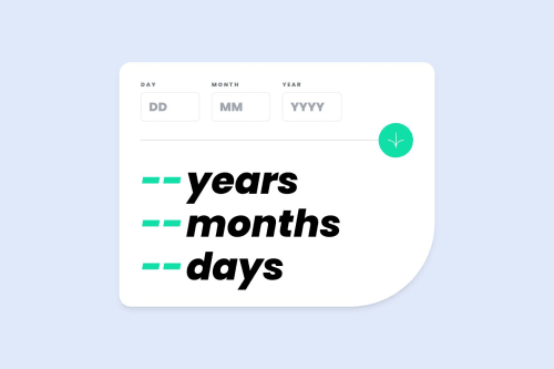
Age Calculator - SASS and (a lot of) JavaScript 😅

Solution retrospective
Hello! I'm Daniel and this is my solution for this challenge! 😊
This project took my Javascript skills to the next level. The design is very simple, but the many different validations were definitely a great challenge. At least for a Javascript Newbie like me. For the first time I had the opportunity to use switch case on a project. My index.js file is a huge monster 😅! But in the end I managed to add all the required features.
I also added some extra features like a counter up animation for the age result and changed the colors.
If you have any suggestions on how I can improve this project, feel free to leave me a comment!
Feedback welcome 😊
Please log in to post a comment
Log in with GitHubCommunity feedback
- @julian1665
My friend, it looks very nice. But it seems buggy, I inputted my birthdate and put out an inaccurate number.
- @ChrisJRM92
Excellent work, I want to add that there is also an error with leap years (February 29) but it is an excellent challenge to practice! 👌
- @davidsonaguiar
Muito bom, parabéns. Dica: Teu js ficou muito grande dá pra simplificar. O resultado deu errado quando coloquei minha data de nascimento. Eu transformeu a data atual e data informada em milisegundos e subtrair e depois convertir em anos, meses e dias.
- @mohamad-hajilo
Excellent 👌👌👍
- @piushbhandari
nice work.
some suggestions:
-
i would make these
<h2 class="text-day" style="color: rgb(113, 111, 111); transition: all 0.2s ease 0s;">Day</h2>into a label and hook it up to the number inputs. like so:<label for="day" class="text-day" style="color: rgb(113, 111, 111); transition: all 0.2s ease 0s;">Day</label>then add in name/id attributes that have the same value as the for attribute to the input. this way when you click on the label it auto focuses on the input. this is good for accessibility -
your .text-day element has an inline style. is there a reason why it's not in a separate stylesheet?
-
it's best practice + good for accessibility if you add type="button" on your button elements
-
you can set the alt tag from the icon inside the button to be empty "" as it's useless information for screen reader users. when you have icons, having alt="" is good enough as it's being used as a decorative image
-
im not sure if there's a tablet design, but when you start to scale the design, the component starts hugging the edges of the screen. i would add side paddings ie.
padding-left: 24px; padding-right: 24px;on the body element for example. -
may need a 2nd opinion on this but those years/months/days text can just be regular <p> tags instead of <h2>s
-
Join our Discord community
Join thousands of Frontend Mentor community members taking the challenges, sharing resources, helping each other, and chatting about all things front-end!
Join our Discord