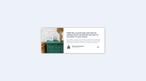
Not Found
Not Found
Not Found
Not Found
Not Found
Not Found
Not Found
Not Found
Not Found
Not Found
Not Found
Not Found
Not Found
Not Found
Not Found
Not Found
Not Found
Not Found
Not Found
Not Found

Submitted

An article preview component using HTML CSS and JavaScript.

@ameyadeokule

Desktop design screenshot for the Article preview component coding challenge

This is a solution for...

  • HTML
  • CSS
  • JS
1newbie
View challenge

Design comparison


SolutionDesign

Solution retrospective


I have made this component entirely using my CSS and JavaScript knowledge and not using any internet resources. So it might not be the best looking but I am the proudest of this one. Please provide feedback positive or negative and surely work on it. I am very appreciative of all the feedback provided to me that has helped me improve on my frontend skills.

Community feedback

@pikapikamart

Posted

Hey, really great work on this one and it's awesome that you made this only by yourself without any other resource:>

The desktop layout is good as well as the mobile view.

Desktop layout seems smaller than the original but preferences right.

I looked in the javascript, it is working just fine. Inside your click event, you change the style of the button, though it is fine, but usually we let the css do work for stylings. We can achieve the same effect with having to manipulate the styling in the js. This is quick tips:>

We only need this

btnShare.addEventListener('click', () => {
	share.classList.toggle('active')
})

Now, how can we change the button? Let's declare some of the css, though scss will be good. But let's just css. Remember to put this inside the 800px breakpoint, like you are using in your javascript.

But first, swap the <div class="button-area"></div> and the <div class="share"></div> in your html. This will not make any changes to the layout but we will use this.

Add this in your css. In the breakpoint of 800 okay.

.share.active + .button-area {
  background:  hsl(212, 23%, 69%);
}

.share.active + .button-area .arrow {
  fill: hsl(210, 46%, 95%);
}

The reason we swap the html element, is that we can use the +. This is a selector which is really good, if you want to target the element, next to it.

Example. We have this two div

<div class="one"></div>
<div class="two"></div>

If we use .one + .two {} then we now have control in the .two selector. That is what we used in the above example. So if the .share selector have the .active class, then it will prompt it to run and then + then target the next element to it which is the .button-area.

This is really responsive because of the breakpoint. If you look at your javascript, it will work only it the user toggles. Try clicking the button in mobile view, do not untoggle, then go back to the desktop layout. The background-color of the .button-area is till blue like the mobile state.

I haven't run what I stated above (sorry for that but I think it will work just fine). Though you can javascript, but I am just showing how awesome css is and what it can achieved. If you need some guide for the different selectors [this is a reference] (https://www.w3schools.com/cssref/css_selectors.asp) to the different selectors.

Overall, you did a really great job^^

2

@ameyadeokule

Posted

@pikamart Thanks for taking the time and reviewing my code. I will surely implement this styling method in further projects.

0

Please log in to post a comment

Log in with GitHub
Discord logo

Join our Discord community

Join thousands of Frontend Mentor community members taking the challenges, sharing resources, helping each other, and chatting about all things front-end!

Join our Discord