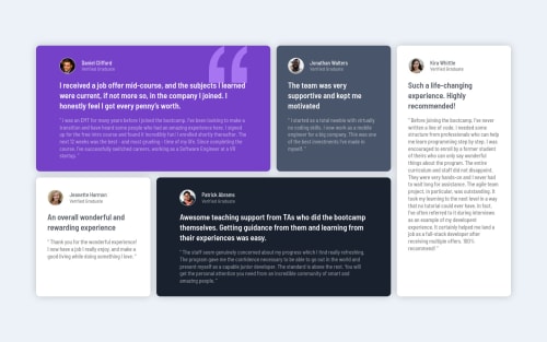
Not Found
Not Found
Not Found
Not Found
Not Found
Not Found
Not Found
Not Found
Not Found
Not Found
Not Found
Not Found
Not Found
Not Found
Not Found
Not Found
Not Found
Not Found
Not Found
Not Found

Submitted

An awesome testimonials page made using Grid and SCSS

#accessibility#sass/scss#bem
Aadvik 1,250

@Aadv1k

Desktop design screenshot for the Testimonials grid section coding challenge

This is a solution for...

  • HTML
  • CSS
2junior
View challenge

Design comparison


SolutionDesign

Solution retrospective


WOW, this definitely was my favorite frontendmentor challenge yet! I had so much fun using grid, and I feel like there are soo many ways to get this done. I chose to do it via grid-template-areas which was such a fun and intuitive approach, loved it :) I would love to get some code review or any other tips.

Community feedback

teamie 470

@tea-scripts

Posted

Great job completing the challenge! However some things you might have missed:

  • Your mobile layout is missing, only your desktop layout is shown even on smaller screens and you might want to take a look at that. It's not set in stone but designing/developing mobile first is considered best approach.
  • In your profile__content you should consider having each item in a separate container or ensure aligning your texts to the left - the author and status aren't aligned.
  • You might have missed the border colors for some cards which you could also look into.
  • Lastly I'd recommend having a distinctive height and width for the rows and columns to try getting the testimonial content looking aligned but this isn't necessary. Good work using SASS and breaking your codes into modules. You're doing a great job keep pushing mate 👍.
0

Aadvik 1,250

@Aadv1k

Posted

@coder-teamie Hey, thanks for the review, for me the layout seems to be working fine, both on tablets and mobile, so I am not sure about that. As for the left alignment I will be sure to put that in.

0
teamie 470

@tea-scripts

Posted

@Aadv1k Perhaps it's a glitch but I'm seeing a two-column layout on the mobile layout and its supposed to be a one-column layout but like I said, it could be a glitch 😁. Keep up the good work!

Marked as helpful

0
Aadvik 1,250

@Aadv1k

Posted

@coder-teamie Its not a bug, its a feature 😆 Jokes aside

EDIT -- Actually yes, I will increase the width of the "small device" media query as it gets a bit squished, thanks :)

  grid-template-columns: repeat(4, 1fr);

  grid-template-areas:
    "e1 e1 e2 e3"
    "e4 e5 e5 e3";

  @media only screen and(max-width: 850px) {
    width: 80%;

    grid-template-columns: repeat(2, 1fr);
    grid-template-areas:
      "e1 e1"
      "e2 e3"
      "e4 e3"
      "e5 e5";
  }

  @media only screen and(max-width: 400px) {
    width: 90%;

    grid-template-columns: 1fr;
    grid-template-areas:
      "e1"
      "e2"
      "e4"
      "e5"
      "e3"
      "e3";
  }
}

I have the following code controlling the layout here, its meant to show you the two column layout on tablet, and a single one on mobiles or smaller screen. It doesn't make sense to have a single column layout on a screen as big as a tablet does it?

0
teamie 470

@tea-scripts

Posted

@Aadv1k Oh I see it now and yes it wouldn't make much sense displaying the one-column layout on the tablet. My advice however is to change the breakpoint for the transition. The change is happening too fast some mobile phones like the iPhone XR upwards and the Samsung S20 aren't tablets but are getting two-column layout and the content doesn't look pretty and seems constrained.

0
Aadvik 1,250

@Aadv1k

Posted

@coder-teamie Yup exactly, I added a fix for that now, appreciate your input :)

0
teamie 470

@tea-scripts

Posted

@Aadv1k You're welcome mate. Good luck with succeeding challenges!

1

Please log in to post a comment

Log in with GitHub
Discord logo

Join our Discord community

Join thousands of Frontend Mentor community members taking the challenges, sharing resources, helping each other, and chatting about all things front-end!

Join our Discord