Not Found
Not Found
Not Found
Not Found
Not Found
Not Found
Not Found
Not Found
Not Found
Not Found
Not Found
Not Found
Not Found
Not Found
Not Found
Not Found
Not Found
Not Found
Not Found
Not Found

Submitted

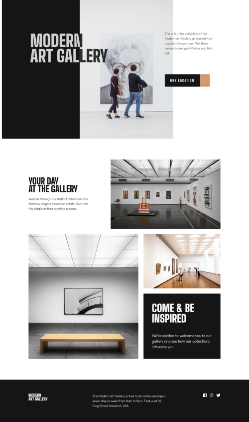
Art Gallery landing page and location page. CSS Grid and Flex

P
Stephen Lyssyβ€’ 30

@Slyssy

Desktop design screenshot for the Art gallery website coding challenge

This is a solution for...

  • HTML
  • CSS
2junior
View challenge

Design comparison


SolutionDesign

Solution retrospective


I think I did ok on this. One thing I noticed is that after I deployed, the location page address section did not fit directly under the map. It works fine when I inspect it in google chrome, but not on my iphone. I overcame this by setting the z-index to 1 for the address section, but all this does is put that section over the map. Not sure why it does this, and any feedback would be greatly appreciated.

Community feedback

Vanza Setiaβ€’ 27,855

@vanzasetia

Posted

Greetings, Stephen Lyssy! πŸ‘‹

Good effort on this challenge! πŸ‘

I have a few suggestions for this solution.

  • I notice that you used button to navigate the user to another page. Why don't use an anchor tag?
  • For the hero-title, I recommend simplifying it. You can use mix-blend-mode to make the text adapt to the background color. CSS Tricks has a great article that will explain how to do it.
  • For the social media links, I recommend wrapping each of the social media icon with an anchor tag. It's a social media link, so it needs to be wrapped by a link element.
  • I suggest making the img as a block element and set max-width: 100% to make it easier to work with img element.
  • Never use 100vw on anything as it doesn't account for scrollbars when present. It may only ever introduce potential overflow/scroll bugs.
  • Use single class selectors for styling whenever possible instead of id. id has high specificity which can lead to a lot of issues on the larger project. It's best to keep the CSS specificity as low and flat as possible. πŸ˜‰
  • The logo images are important content of the site. It should have some alternative text to them. Otherwise, the screenreader users would not know the name of the site.

That's it! I hope you find this useful! 😁

Marked as helpful

2

P
Stephen Lyssyβ€’ 30

@Slyssy

Posted

@vanzasetia Thank you for the feedback. I usually do set buttons as anchor tags, but I just saw this onclick solution, and I wanted to try it. I mean, it works, and it's a simple solution for a button. I just forgot to do it on the social media links.

Thank you for letting me know about the mix-blend-mode. I've never heard of that before. I'm still very new to coding. That would have saved me a lot of headaches. I will update my code to reflect that. Very cool! Thank you.

0
Vanza Setiaβ€’ 27,855

@vanzasetia

Posted

@Slyssy You're welcome! πŸ‘

Regarding the button, it behaves like a link but it is a button element. It may not confuse normal users. But, screenreaders would pronounce it as a button so the screenreader users will think that it is a button (perform an action) for sure. So, I recommend using anchor tag instead.

Marked as helpful

0
P
Stephen Lyssyβ€’ 30

@Slyssy

Posted

@vanzasetia I did not know that. I will make the update when I get a chance. Thank you for the feedback.

1
Tesla_Ambassadorβ€’ 2,980

@tesla-ambassador

Posted

Hey Stephen, congrats on completing this challenge, It must have been fun!!! Here's a few pointers:

  • I also checked out your solution on my phone and it seems okay. The location page address section is also fine on my computer when I inspect it. I don't know what the problem could be or what browser you are using on your phone. Also, z-index just sets the z-order of positioned elements and those elements with a higher z-index overlap those with a small one so it wouldn't help with positioning an element beyond it's z-order
  • Having a Div within a button is sure to generate some errors, you might consider just removing the divs containing the button text and the <img> tag and you could just let me be as they are so your code will look like this <button> text <img></img> </button> That should solve some of your HTML validation issues.
  • In order to resolve some of your accessibility issues, you might wanna use landmarks in your html code, these help browsers easily navigate your code. So you might consider wrapping your divs in landmarks like <main> or <header> or <footer> you need to do this according to how your page is structured. Incase you want to know more about landmarks, follow this link.

Happy Coding! πŸ‘

Marked as helpful

1

P
Stephen Lyssyβ€’ 30

@Slyssy

Posted

@tesla-ambassador Thank you for the feedback. I know that z-index only sets the z-order. I did that because at least that way it the image would not cover up the top of the box below it. Basically, it cut off the bottom 30px of the image. I think the issue I was facing was due to the fact that I was using Safari as my browser on my phone. When I viewed it with Chrome, it was fine.

Also, I really like your button solution. I will use that in the future. That was the first time I created a button like that, and I wasn't sure how to do it. Thank you.

1
Tesla_Ambassadorβ€’ 2,980

@tesla-ambassador

Posted

@Slyssy I am glad I could help! I think Safari was the problem cause I was also viewing it on chrome

0

Please log in to post a comment

Log in with GitHub
Discord logo

Join our Discord community

Join thousands of Frontend Mentor community members taking the challenges, sharing resources, helping each other, and chatting about all things front-end!

Join our Discord