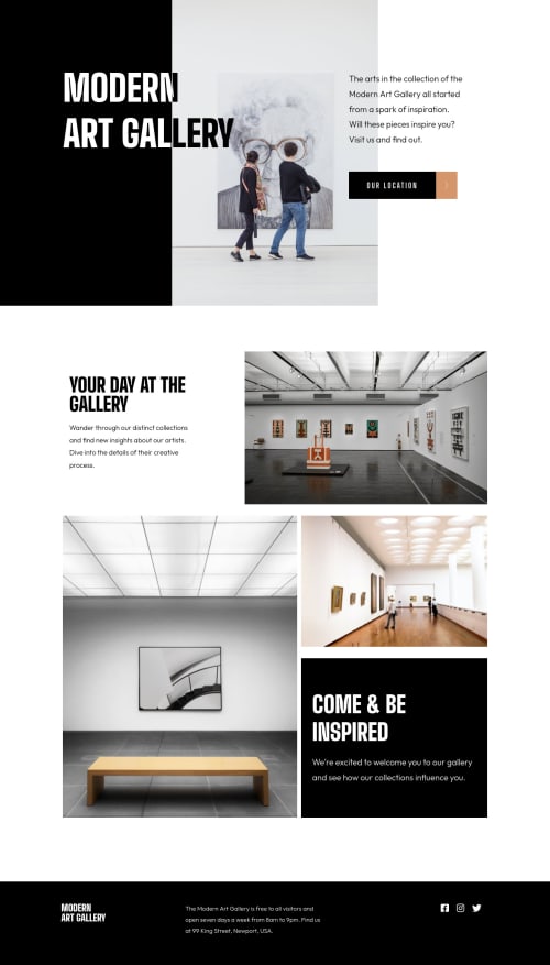
Art Gallery Site

Solution retrospective
Really happy with this challenge. I will say the biggest thing I'd need to learn is being able to create cleaner code when it comes to different-sized images (i.e. an image for desktop, another for tablet, and another for mobile). If anyone has tips on streamlining that that would be so helpful.
Also I know that it's important to add landmarks to the sections (i.e. <section</section>, <footer></footer>), however whenever I do I always have extra so I'm not sure if there's something I should be doing to be able to avoid that.
Anywho, any feedback is always welcomed!
Please log in to post a comment
Log in with GitHubCommunity feedback
- @md5dalton
Nice job Naomi...
If you want to render alternative sizes of an image for different display or device scenarios, you can always use
<picture></picture>element, it offers that functionality. If you want to read more on how to use it, here's a link to MDN web docs: The Picture element.I'll show you below an example of how you could have done it in your solution:
<picture>
        <source srcset="assets/desktop/image-hero.jpg" media="(min-width: 1200px)" />
        <source srcset="assets/tablet/image-hero.jpg" media="(min-width: 751px)" />
        <img src="assets/mobile/image-hero.jpg" alt="hero"/>
</picture>
And there's no need for
display: noneon image selectors in your css.
Join our Discord community
Join thousands of Frontend Mentor community members taking the challenges, sharing resources, helping each other, and chatting about all things front-end!
Join our Discord