


@vanzasetia
Posted
Hello, Huynh Nguyen! 👋
Good effort on this challenge! 👍 The site also has some scrolling animation however, it's not respecting the user prefers-reduced-motion settings. So, I recommend making sure that for the users who don't want to see any animations, the animation won't run.
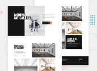
On 870px viewport width, the footer three-column layout is too narrow.
@media (min-width: 860px)
.footer {
    /* padding: 10rem 16.5rem; */
   /* reduce the amount of padding */
}
More suggestions from me.
- There's no
headerelement on this site.headerelement containsnavand the logo of the site. In this case, the first section should be lived inside themainlandmark. It should be the first section of the main content. - The "Modern Art Gallery" inside the
headerlooks different from the design. It's possible to do the reverse text color based on background color by usingmix-blend-modeproperty. I recommend reading this CSS Tricks blog post about it. - The arrow icon is also different from the original design. There are
icon-arrow-right.svgandicon-arrow-left.svgthat you can use. - For the images, I recommend using the
pictureelement instead ofimgelements. It is a good challenge to usepictureelements. In this case, it is used for the art direction. You can learn about it on the MDN documentation forpictureelement. - Use CSS to uppercase the text. The uppercased word in the HTML might be spelled by the screen reader (spelled letter by letter).
- Each page should only contain one
h1. I recommend making theh1on thefooterash2instead. - Each social media icon should be wrapped by link elements. As you may already know that these are actually the social media links for the company.
- I recommend removing the commented text content. It's not a big deal but, it's going to reduce the file size of both HTML. It means that the site would load faster because of it.
Now, specifically for CSS.
- I don't recommend changing the
htmlor the:rootfont size. It can cause huge accessibility implications for those users with different font size or zoom requirements. I suggest reading this article by Josh Comeau where he tells about the problem of the 62.5% trick (and more!). Also, I recommend reading what an accessibility expert (Grace Snow) has said about it. - I suggest making the
imgelement as a block element (by default, it is an inline element) and settingmax-width: 100%. I also suggest writing it as part of the CSS reset. This way, you don't have to keep specifying it each time you want to style theimgelement.
One last thing, for some reason, I can't Tab through the links. I don't know what causes it. But, hopefully, you can solve the issue.
That's it! Hope you find this useful!
Marked as helpful
@Nghuynh07
Posted
@vanzasetia thank you for taking your time to write this feed. This was very helpful. I appreciate it a lot.
@vanzasetia
Posted
@Nghuynh07 You're welcome! Glad you found it helpful! 😄
@Nghuynh07
Posted
@vanzasetia It certain did. I had no idea prefers-reduced motion was a thing. I am going to start adding it onto my CSS. I definitely learned not to reset my font to 62.5% and I learned new CSS property for mix-blend-mode. I really like learning these little things. It makes writing CSS so much easier in the long run.
@vanzasetia
Posted
@Nghuynh07 Cool! Keep it up! 👍
